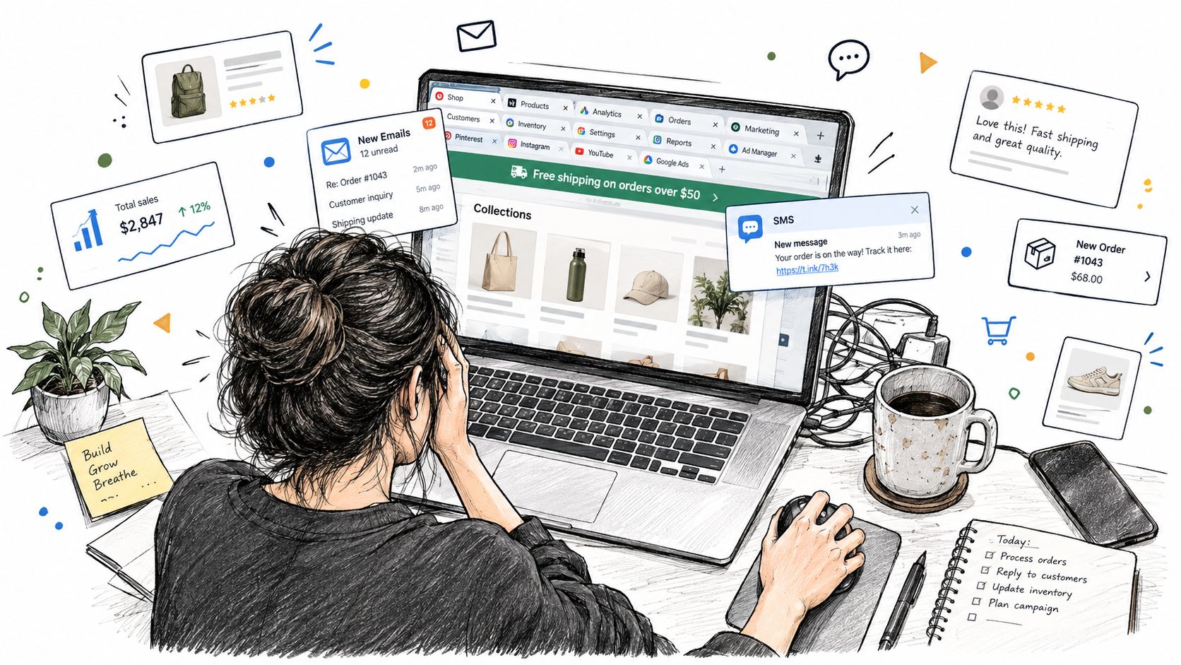
A Shopify merchant can have more traffic, more products, and more promotional tools, yet make it harder for shoppers to buy. One browser tab holds the theme editor, another shows Shopify Analytics, a third has the email app open, while an SMS banner, free-shipping bar, discount code, upsell drawer, and recommendation carousel compete for attention on the storefront.
The catalog may show fifteen versions of the same hoodie in slightly different shades. The customer still has to decide which product to open, which offer to trust, whether another code is better, and whether waiting might produce a stronger deal. So many options don’t create confidence by themselves. They often create delay.
For Shopify brands, the answer isn’t always a smaller catalog. It’s a clearer path through the catalog, fewer competing offers, and promotional mechanics that give shoppers a reason to act without teaching them to wait. That matters for conversion, margin, and the perceived value of the brand.
When More Choices Stop Working
The merchant sees the problem in fragments. Sessions rise, yet add-to-carts stay flat. Checkout completion slips over several weeks. The response is familiar: add another campaign, another sitewide code, another collection badge, and another app to recover visitors who did not decide.
Those additions become a sequence of decisions for the shopper. First comes the announcement bar or the email pop-up. Then the automatic free-shipping message competes with a discount code from a previous visit. On the collection page, nearly identical colors, multiple fits, and several product cards offer no clear starting point.
By the product page, the customer is choosing more than a hoodie. They are weighing color, size, delivery, promotion, bundle, and timing. A cart drawer introduces another offer, while an upsell requests another decision. The purchase becomes one route among several, and promotional clutter starts competing with the product itself.
The stalled shopper isn’t always a low-intent shopper
Merchants often misread this data. A shopper who leaves may have arrived ready to buy. The store asked them to resolve too many small uncertainties before completing the purchase.
Choice overload does not require an enormous catalog. It appears through stacked decisions: the collection page, variant selector, discount message, cart drawer, shipping threshold, and post-add-to-cart recommendation each add mental work. Together, they can delay a purchase that the product already earned.
Practical rule: Treat every visible offer and optional path as a decision the shopper pays for with attention.
Audit the promotion sequence before cutting useful products. Give one product a clear priority, one offer the main surface, and secondary prompts a later role. A tighter route protects conversion, preserves margin, supports brand equity, and gives time-bound promotions a reason to act now instead of another reason to wait.
What Choice Overload Actually Is for Shoppers
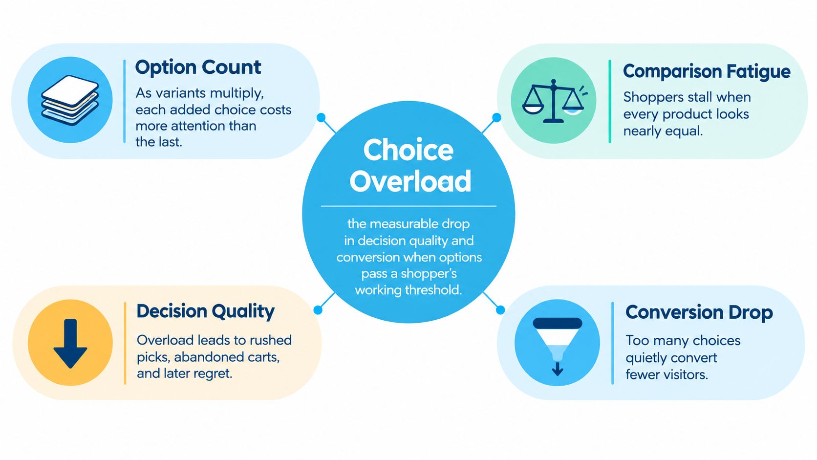
Choice overload is the decline in decision quality and conversion that occurs when competing options exceed a shopper’s working threshold. The relationship isn’t linear. Too few choices can make a store feel limited, while too many divide attention, increase comparison effort, and encourage postponement.
A Shopify merchant should count more than products. A shopper may encounter:
- Collection density: A long grid with similar products and no clear hero item.
- Variant matrices: Several colors, fits, materials, and sizes presented with equal visual weight.
- Filters and sorting: Useful controls that become another layer of work when exposed all at once.
- Cross-sells and upsells: Additional products that interrupt the primary buying path.
- Recommendation carousels: More alternatives appearing after the shopper has already chosen.
- Promotional messages: Codes, gifts, shipping thresholds, banners, and limited offers competing on the same session.
The result is an inverted-U pattern. A store needs enough variety to serve different needs, but each added option eventually produces less value and more comparison cost. A recommendation carousel can help a shopper who needs an alternative. The same carousel can stall a shopper who already found the right product.
The useful unit isn’t SKU count. It’s decision-point count.
Reduce decisions, not relevance
A smaller catalog isn’t automatically better. Removing products that serve distinct use cases can reduce relevance and make the store feel generic. The sharper move is progressive disclosure, showing the most useful path first and revealing additional choices only when the shopper needs them.
That might mean one recommended collection sort, a compact variant presentation, or a single primary offer with the terms stated plainly. The shopper still has access to the full range, but they don’t have to process the full range before acting.
The consumer psychology behind choice overload is useful here because it shifts the question from “How many products should we show?” to “How much mental work are we asking a shopper to do?” Your target isn’t the minimum number of options. It’s the minimum number of decisions required to buy confidently.
The Three Costs of Too Many Options on Your Store
Overload creates a conversion problem first, but the damage doesn’t stop at checkout. It affects how shoppers judge the brand and how aggressively the merchant feels forced to promote.
A customer who encounters too many forks can abandon a cart after doing substantial research. Another may choose a product but leave unsure whether a different color, bundle, or offer would have been better. That uncertainty makes the purchase feel less settled and can weaken the shopper’s willingness to pay full price later.
The same clutter affects brand perception. If every product and promotion receives equal emphasis, shoppers struggle to identify the flagship item or understand what the brand stands for. A storefront that looks interchangeable gives customers fewer reasons to accept its pricing.
The third cost arrives in the promotion calendar. When hesitation looks like a demand problem, merchants often add a deeper discount. That can produce short-term movement, but it also reduces the room available for future offers and teaches customers to evaluate the promotion before evaluating the product.
| Cost | What Shoppers Do | What It Costs the Store |
|---|---|---|
| Stalled carts and checkouts | Compare, defer, or leave before completing the order | Lost conversion after acquisition spend has already been incurred |
| Weaker brand perception | Treat products as interchangeable and question full-price value | Lower pricing power and weaker brand equity |
| Escalating discounts | Wait for a stronger code or broader promotion | Margin pressure, lower full-price sell-through, and promotion dependency |
The evidence against discounting by reflex
A 2023 national study of more than 2,200 U.S. ecommerce shoppers found that 62% of apparel shoppers wait for discounts before buying, and shoppers were about 2x more likely to buy a product with a 20% discount than a non-discounted average-priced alternative. The same discount statistics analysis found shoppers were 2.8x more likely to buy at a 20% discount when the original price was perceived as above average, while a 50% discount made shoppers 99% more likely to purchase than a 20% discount.
Those figures explain why discounting feels effective. They don’t make deeper markdowns a complete strategy. The merchant still has to account for the value surrendered on orders that might have converted with a clearer path and a more deliberate offer.
Simplifying the store is therefore a conversion-economics decision, not a cosmetic UX project. Every removed distraction can protect the margin that another discount would have consumed.
Why Adding More Discounts Can Train Shoppers to Wait
A stalled conversion rate often triggers the same response: increase the discount. Add a higher tier, extend the campaign, make the code sitewide, and tell customers the offer ends later.
That approach can solve an immediate objection while creating a new expectation. If shoppers repeatedly see the same percentage-off structure, the discounted price becomes their reference point. Full price starts to feel less like the normal price and more like a penalty for buying early.
A 2017 study on price promotions and brand equity reported that frequent price promotions and intensive discount-store distribution negatively influence brand equity. A separate 2012 study found that lower prices were associated with lower perceived brand quality in an evaluation setting. Those findings support a hard operational truth: a promotion can close a sale while changing what the shopper believes the product is worth.
The discount-training loop
The pattern is easy to recognize in Shopify data:
- Conversion softens because shoppers face too much friction.
- The merchant launches a stronger or broader promotion.
- Shoppers learn that waiting may produce a better price.
- Full-price demand weakens between campaigns.
- The next promotion needs more attention or a deeper concession.
The loop becomes especially expensive when the team measures only conversion during the campaign. A promotion may move orders while reducing future willingness to buy without a code.
A 2026 consumer-discount analysis reported that 91% of Americans check for discounts before an online purchase, 92% redeem at least one discount each year, and 68% have made an unplanned purchase after receiving a discount. The same consumer discount analysis reported that coupon users spend 24% more than non-users at online retailers, while 70% of consumers can be influenced into impulse purchases by discounts.
Those behaviors make promotions powerful, but power without boundaries creates dependency. The store should use a discount to change a decision, not to compensate for a storefront that asks shoppers to make too many decisions.
Why framing matters
Discount presentation also changes how customers interpret value. A 2012 review of price-promotion effects found that price-based promotions can lower perceived brand quality, and that the framing of a discount matters. The review of price-promotion effects reported that low discounts presented in currency terms and high discounts presented as percentages were associated with higher quality perceptions than the reverse framing.
The practical implication is straightforward. Stop adding discount tiers to solve uncertainty. First remove the competing choices. Then use a bounded promotion when the shopper needs a credible reason to act now.
Practical Ways to Simplify Assortments and UX
Shopify gives merchants plenty of control, but control can produce clutter if every option stays visible by default. Simplification means choosing the route the average shopper should take, then keeping exceptions available without giving them equal prominence.
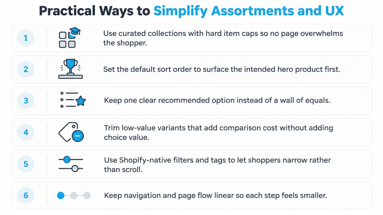
Start with the collection page. Curate priority collections around a defined shopping mission, and set a hard limit on the products shown before pagination or a secondary browsing action. Surface the intended hero product first instead of relying entirely on recency or algorithmic ordering.
Six cuts that reduce decision friction
- Cap curated collections: Give each collection a deliberate stopping point. A focused edit helps shoppers understand the range before they face the long tail.
- Choose a default winner: Use merchandising logic to place the product that best represents the collection first. Don’t make customers discover your recommendation accidentally.
- Keep one clear recommendation: Mark a preferred option with useful reasoning, such as fit, use case, or material. Equal emphasis turns comparison into work.
- Trim low-value variants: Hide or retire variants that attract little demand but add visual and cognitive cost. Keep the operationally important choices easy to find.
- Use filters progressively: Shopify-native filters and tags should help shoppers narrow the catalog, not expose every possible attribute at once.
- Keep the flow linear: Pin one primary CTA, reduce secondary actions in the cart drawer, and delay optional recommendations until the main purchase is secure.
Use evidence to decide what stays
Review the last thirty days of heatmap and session-recording data. Look for repeated taps on inactive elements, hesitation around variant selectors, back-and-forth movement between products, and cart-drawer interactions that precede exits.
Don’t treat every click as proof that an element helps. A frequently opened size guide may signal useful intent, but repeated opening and closing of a promotion panel may indicate confusion. Pair behavioral evidence with product data, inventory constraints, customer-service questions, and returns.
For apparel brands, visual confidence can remove a separate comparison task. A resource on virtual models for clothes can help merchants show fit and styling context without adding more products to the collection page.
The principles behind choice architecture for ecommerce apply beyond product grids. Simplify the offer surface, cart behavior, navigation, and post-purchase prompts as one system. A clean collection page won’t protect margin if five competing promotions still appear before checkout.
Blanket Discounts versus Time and Quantity Bound Offers
An open-ended percentage-off code tells shoppers there’s no cost to waiting. A time-bound or quantity-bound offer establishes a stopping condition. That distinction changes the decision frame without requiring the merchant to make every campaign deeper.
Blanket discounts work well when the objective is broad eligibility, straightforward communication, or seasonal clearance. They also create predictable behavior. Customers can save the code, compare other products, and return later. If the campaign runs repeatedly, waiting becomes part of the shopping routine.
Bounded offers use a different structure. A flash window can close at a stated time. A first-to-claim reward can run out. A threshold gift can make the next purchase step more valuable without cutting every item’s price. A first-N-orders bonus can reward early action while preserving a clear limit.
| Dimension | Blanket Discount | Time/Quantity Bound Offer |
|---|---|---|
| Shopper instruction | Buy whenever the code remains valid | Act before the time or quantity limit changes |
| Margin control | Exposure continues across eligible orders | The merchant defines the campaign boundary |
| Urgency | Usually weak unless paired with a credible deadline | Built into the time, quantity, or tier mechanic |
| Customer expectation | Encourages code checking and future waiting | Rewards early action rather than delayed comparison |
| Operational risk | Over-redemption and prolonged discount exposure | Inventory, fulfillment, and customer-service pressure if limits aren’t clear |
| Best fit | Broad clearance or simple eligibility | A conversion trough, launch moment, or controlled inventory push |
Match the structure to the job
Use a blanket offer when you need to move a clearly defined seasonal range and can accept broad redemption. Don’t use it as the default response to every flat period.
Use a bounded offer when the objective is decision speed. Scarcity bias makes limited availability more salient. Loss aversion makes the cost of waiting feel more concrete. Temporal discounting pushes value toward the present, which is useful when a shopper already has product intent but lacks a reason to complete the purchase.
A 2025 consumer-behavior article explains that limited-time windows, capped rewards, and seasonal deadlines create an “act now” frame, while scarcity increases the perceived cost of waiting through loss aversion and FOMO. Its analysis of the psychology behind sales promotions also makes the operational point that time pressure and perceived exclusivity must be credible enough to change decision latency, not merely decorate the offer.
Independent flash-sale research from 2025 similarly links time-limited promotions with impulsive buying, reduced comparison shopping, and lower decision friction. The flash-sale research supports combining a credible quantity cap with a credible time cap, because each constraint reinforces the other.
The goal isn’t pressure for its own sake. It’s a simpler choice: buy within the defined window, or accept that the offer may no longer be available. For merchants, that structure protects the difference between motivating action and training delay. A useful review of alternatives to discounting starts from that same distinction.
A Sharper Default for Shopify Merchants
Treat every collection, pop-up, banner, and promotional slot as a constrained budget. The question isn’t what else you can add. It’s what deserves the shopper’s limited attention right now.
Set one primary offer per surface. Cap concurrent promotions across the storefront, Klaviyo email, SMS, social placements, and cart experience. If a shopper sees a sitewide code, free-shipping threshold, gift offer, and tiered discount at the same time, the store has made the customer compare the promotions before choosing the product.
Measure the outcome beyond session conversion. A better dashboard includes:
- Incremental margin: Did the promotion create profitable demand, or shift orders that might have happened anyway?
- Full-price sell-through: Are customers still buying without a code between campaigns?
- Promotion redemption depth: How much value did the average order require before conversion?
- Time-to-cart: How long does it take shoppers to move from landing to a committed cart?
- Repeat-purchase behavior: Did the campaign create customers who return without waiting for another markdown?
Quikly provides one way to run behavior-driven promotions on Shopify. Its campaigns can make rewards time-bound, quantity-bound, or tiered, with branded promotional experiences that customers actively engage with rather than a passive discount appearing everywhere. Quikly says its mechanics have been refined across more than 60 million consumer interactions, and it reports a roughly 20% lift in profit for Jordan Craig, with incremental lift visible immediately on activation.
The broader operating model is more important than any individual tool. Cut unnecessary decision points, make the primary route obvious, and reserve urgency for moments where a real limit exists. Review assortment and promotional clutter quarterly so the store doesn’t drift back into a crowded default.
Start by auditing one high-traffic collection and one promotional journey this week. Remove competing offers, choose the product you want shoppers to see first, and test a time or quantity boundary against an open-ended discount while tracking margin, full-price sell-through, redemption depth, and time-to-cart. If you want to build that kind of controlled, on-brand promotion on Shopify, visit Quikly and evaluate whether its urgency and scarcity campaigns fit your next merchandising test.
Topics: so many options, choice overload, conversion rate, ecommerce UX, Shopify