
Most promotion advice tells Shopify brands to push harder, discount deeper, and add another timer. That usually buys a short burst of revenue and leaves the store with weaker margin, more promo fatigue, and customers who’ve learned to wait.
Choice architecture is the better lens. It’s the design of the decision environment, the way a storefront shapes what people notice, what feels like the default, and whether buying now feels easier than waiting. In ecommerce, that’s not theory. It’s product page order, bundle presentation, cart flow, checkout friction, and how promotions are framed.
What Choice Architecture Actually Means on a Storefront
A storefront is never neutral. The way you place a variant, preselect a shipping method, surface a bundle, or sequence the path to checkout already shapes behavior, whether you planned it or not. That’s the practical meaning of choice architecture, the structure around the choice, not the offer itself.
For a Shopify merchant, the mistake is treating promotion as a layer on top of a page that’s already “done.” In reality, the page is the promotion environment. A well-placed default can reduce hesitation. A cluttered product page can turn a good offer into a slow one. A bundle that reads as the obvious next step can do more than a blunt discount ever will.
The default is doing work even when you didn’t choose it
If you don’t set a clear default, Shopify theme conventions usually do it for you. That can mean the wrong size gets highlighted, the least useful shipping option sits first, or every variant feels equally important. Once that happens, the shopper has to do extra mental work before they can buy.
Practical rule: if a shopper has to think too hard about the basic path to purchase, your promotion is paying for friction you created.
The point isn’t to remove choice. It’s to make the decision path legible. On a storefront, the default should reflect the outcome you want most customers to take, not the layout that happened to ship with the theme.
Every promotion sits inside a decision path
A discount code in isolation does almost nothing if the product page, cart drawer, and checkout all ask for different decisions at once. The shopper sees size, color, bundle, warranty, shipping, and payment choices in one sequence, and every extra step raises the chance they pause.
That’s why choice architecture matters to Shopify brands now. The promo itself may be fine. The environment around it often isn’t. If the environment is messy, the brand ends up using deeper discounts to overcome self-inflicted hesitation.
The Behavioral Principles Behind Choice Design
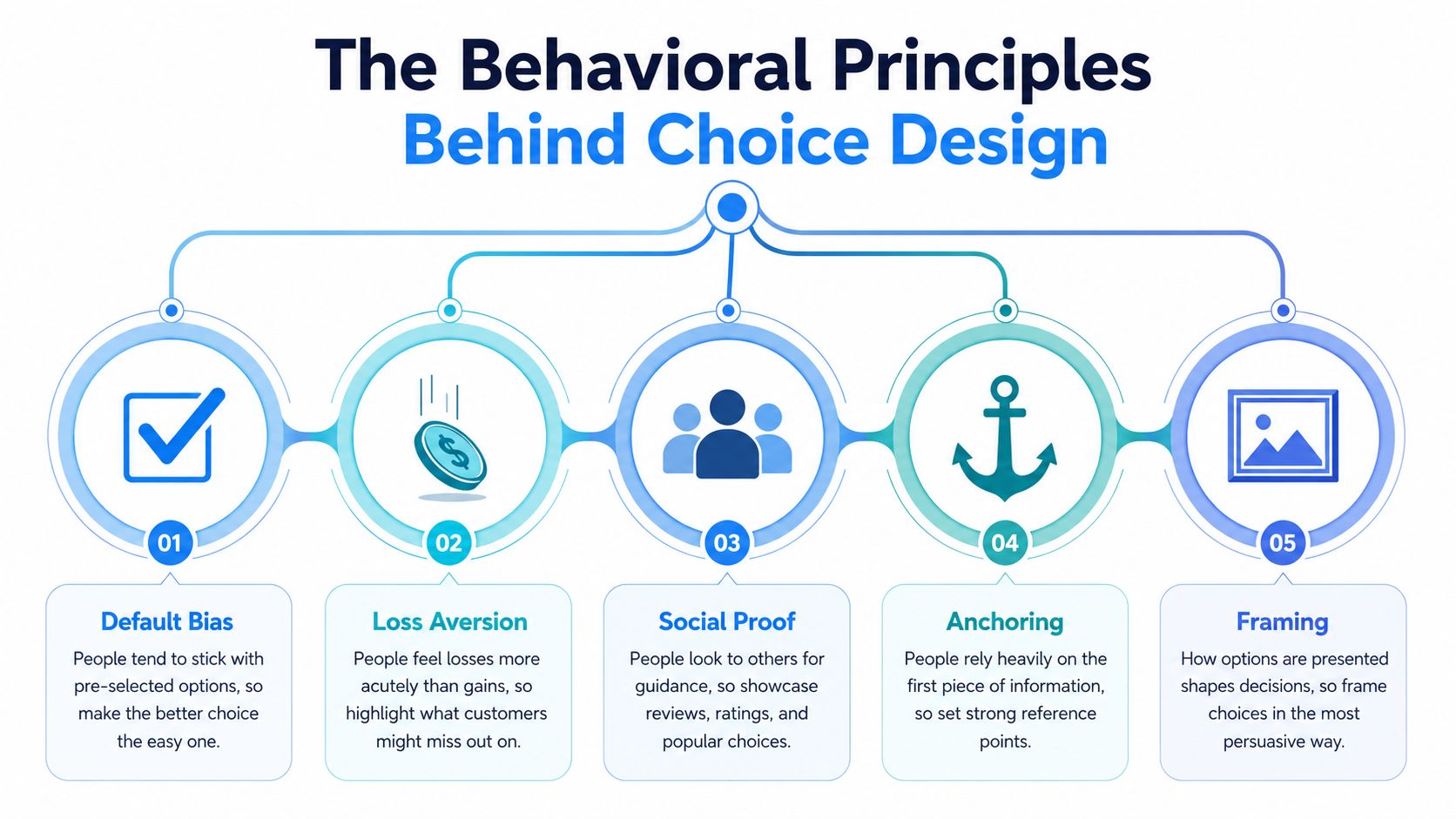
Defaults shape the path of least resistance
The most studied principle in this space is default bias. People tend to accept the preselected option because it’s cognitively cheaper than reworking the decision. On a storefront, that can be a subscription toggle, a shipping method, or a recommended variant.
Defaults work because they lower effort. They don’t need to feel clever, they just need to align with what most customers would reasonably choose if they slowed down and thought it through. A default that saves time helps. A default that benefits the merchant while confusing the shopper backfires.
Loss aversion makes missing out feel heavier than gaining a little
Loss aversion shows up whenever a shopper feels like they might miss value by waiting. That can be a genuine limited reward, a capped bundle, or a disappearing bonus tied to action. The key is that the missed outcome has to feel real.
Social proof works best when it’s specific
A best-seller tag, review count, or “most chosen” label can help, but only when it’s believable and relevant. Overuse it and it turns into wallpaper. Shoppers stop reading it the way they stop noticing generic banner copy.
Anchoring and framing change how the same offer lands
A strikethrough compare-at price gives the shopper a reference point. So does a bundle page that starts from the full individual price before showing the combined offer. That’s anchoring. Framing is the language around the offer, the same reason a product can feel premium in one description and cheap in another.
Friction is the silent tax on every conversion
The last principle is the one many teams underestimate. A one-click pay option, address autocomplete, and a clean guest path don’t feel like marketing, but they shape conversion more directly than a lot of campaign copy does. Less friction means less reason to postpone.
For a deeper primer on these patterns in interface design, the Quikly article on behavioral design principles is worth a look.
Why Choice Architecture Matters for Shopify Brands
Most Shopify merchants reach for discounts because they are fast, easy to launch, and easy to explain internally. Traffic is expensive, conversion is uneven, and a blunt sale feels like the safest move. The trade-off is familiar. Deeper markdowns can lift orders while weakening margin and training customers to wait for the next promotion.
Deliberate choice architecture gives a store another way to move behavior. It makes the desired action easier without forcing the brand into a heavier discount cycle every time. For a merchant running promotions this quarter, that can mean a better default, a cleaner bundle path, or a promotion that rewards action now instead of waiting for the next generic sale.
The research says the effect is real, but context matters
A 2022 PNAS meta-analysis pooled 447 effect sizes from 212 publications and 2,148,439 participants, and found that choice architecture interventions produced an overall statistically significant behavior-change effect of Cohen’s d = 0.43 with 95% CI [0.38, 0.48] and P < 0.001. That is a small-to-medium effect in behavioral science, and it came from work across multiple domains, locations, and populations, not one narrow use case (PNAS).
The same analysis found wide domain differences, with effects in food choice reaching up to 2.5 times larger than in health, environmental, financial, prosocial, or other domains. For ecommerce, the lesson is straightforward. Choice architecture works, but not in a vacuum. The store context, the offer, and the audience decide how much lift you get.
What this means for Shopify: the same tactic that nudges a shopper in one category can stall in another. A merchant needs design discipline, not a copy-paste nudge library.
The margin conversation has to stay in the room
A promotion that raises conversion while crushing margin is a bad trade, even if the dashboard looks healthy for a week. Finance will catch up with that result. If a store uses a heavier discount to force a modest lift, it may be giving away future pricing power for short-term volume.
Choice architecture matters because it can change behavior without making the store dependent on larger and larger discounts. It also helps protect brand perception. The customer experiences a cleaner decision path instead of another noisy markdown blast, which matters when you are trying to hold price integrity between campaigns.
Digital design is now a major battlefield
The UK government’s evidence review on online choice architecture found that a pre-selected default option is 27% more likely to be chosen in a two-option choice, and it rated defaults as the strongest-evidence category in its framework (UK government review). The same review also covered online mechanisms like defaults, ranking, partitioned pricing, bundling, and choice overload.
As noted in the same review, hidden rejection paths also change behavior. When “reject all cookies” is buried, rejection rates fall in both survey visits and organic browsing, while baseline interfaces still produce high accept-all rates. Those are not ecommerce metrics, but they show how digital architecture can steer action at scale.
For Shopify merchants, the practical point is obvious. Every default, label, and offer structure tells the shopper what to do next. If the store wants to protect margin and avoid training people to wait for the next sale, it has to treat choice design as part of the promotion strategy, not just a UX detail.
Five Design Patterns You Can Apply This Quarter
Start with the product page defaults
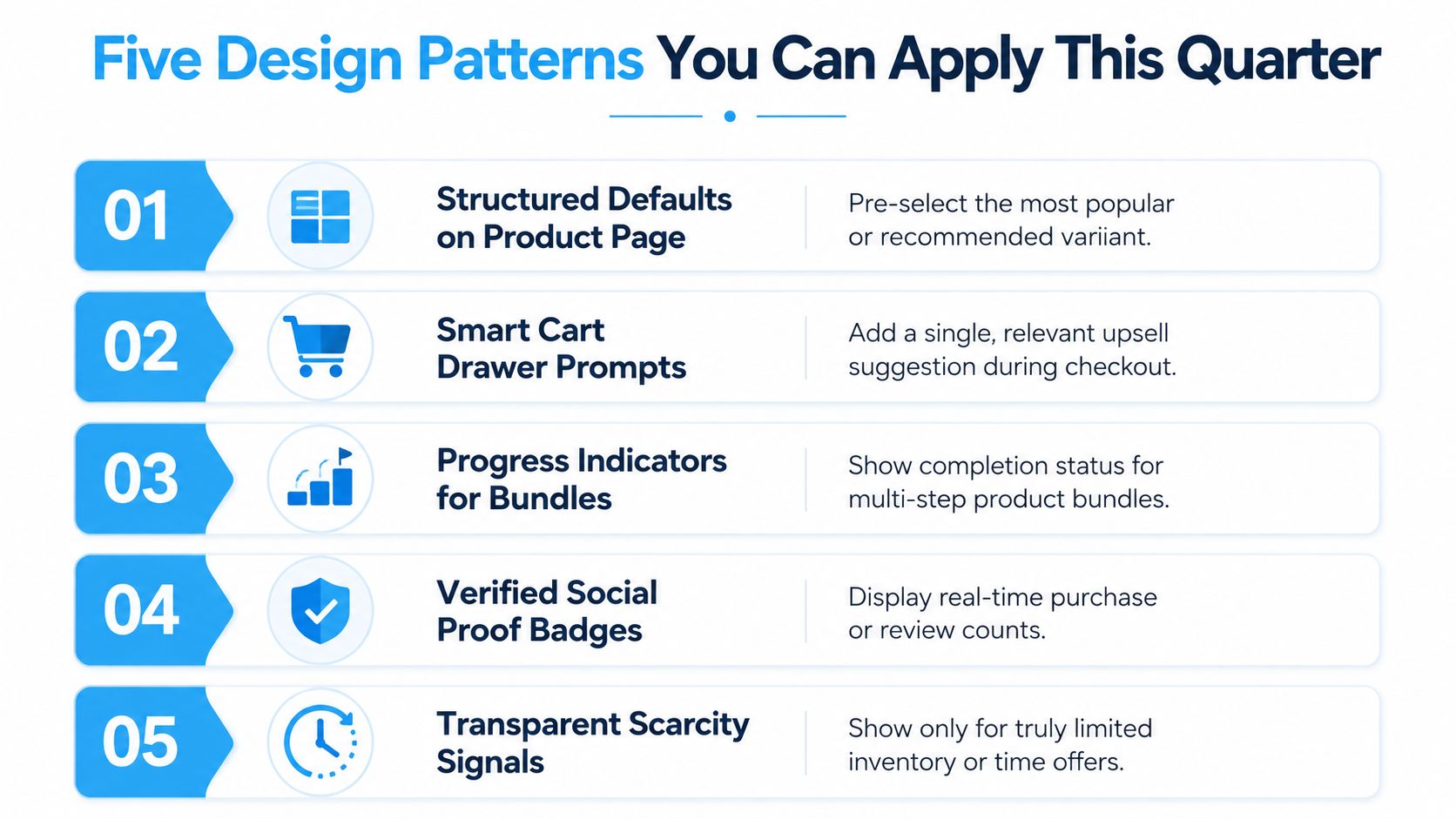
If your best-selling size, color, or pack size isn’t the default, fix that first. A shopper shouldn’t have to decode your catalog to find the most likely answer. The goal is to make the right option feel like the obvious starting point, not an extra click buried under choice overload.
That same logic applies to add-ons. If a warranty, subscription, or gift-wrap option is valuable for a specific product, surface it in a way that feels like a recommendation, not an interruption. The metric here is clean product-page progression, because fewer confused visitors stall before they hit cart.
Use bundles to change the reference point
Bundles work better when they change what the shopper compares the offer against. A two-item bundle that feels like the natural next step often beats a naked percentage-off banner because it reframes value instead of just lowering price.
That’s especially useful for Shopify brands selling replenishable or complementary products. A bundle can protect perceived value while still giving the shopper a reason to act now. If you want a useful practical angle on this for recurring offers, subscription add-on strategies are a smart reference point.
Reduce checkout friction where it actually appears
The highest-friction moments are usually boring ones. Address fields, payment selection, and unclear shipping steps can do more damage than the offer itself. Address autocomplete, Shop Pay, and a sensible guest flow remove some of that drag.
Make progressive disclosure do the heavy lifting
Not every option belongs on the first screen. Show the next decision when it becomes relevant, not before. A product page that reveals enough to buy, then layers in configuration only when the shopper signals intent, usually performs better than a page that dumps every variant upfront.
Reward action, not waiting
Earned incentives matter. A signup reward, a claim-based bonus, or a capped promotional tier gives the shopper a reason to act now without teaching them to wait for the next broad discount. For merchants who want a model built around capped claims and on-brand promotional experiences, Quikly is one way to structure that mechanic without turning the store into a generic timer overlay.
If you’re deciding how the CTA itself should work, the CTA button guidance from Ecommerce Boost is useful because it keeps the discussion on clarity and action, not gimmicks.
Practical rule: don’t ask a promotion to do the work of a broken product page. Fix the page first, then let the promotion create urgency.
Urgency and Scarcity Tactics That Hold Up Under Scrutiny
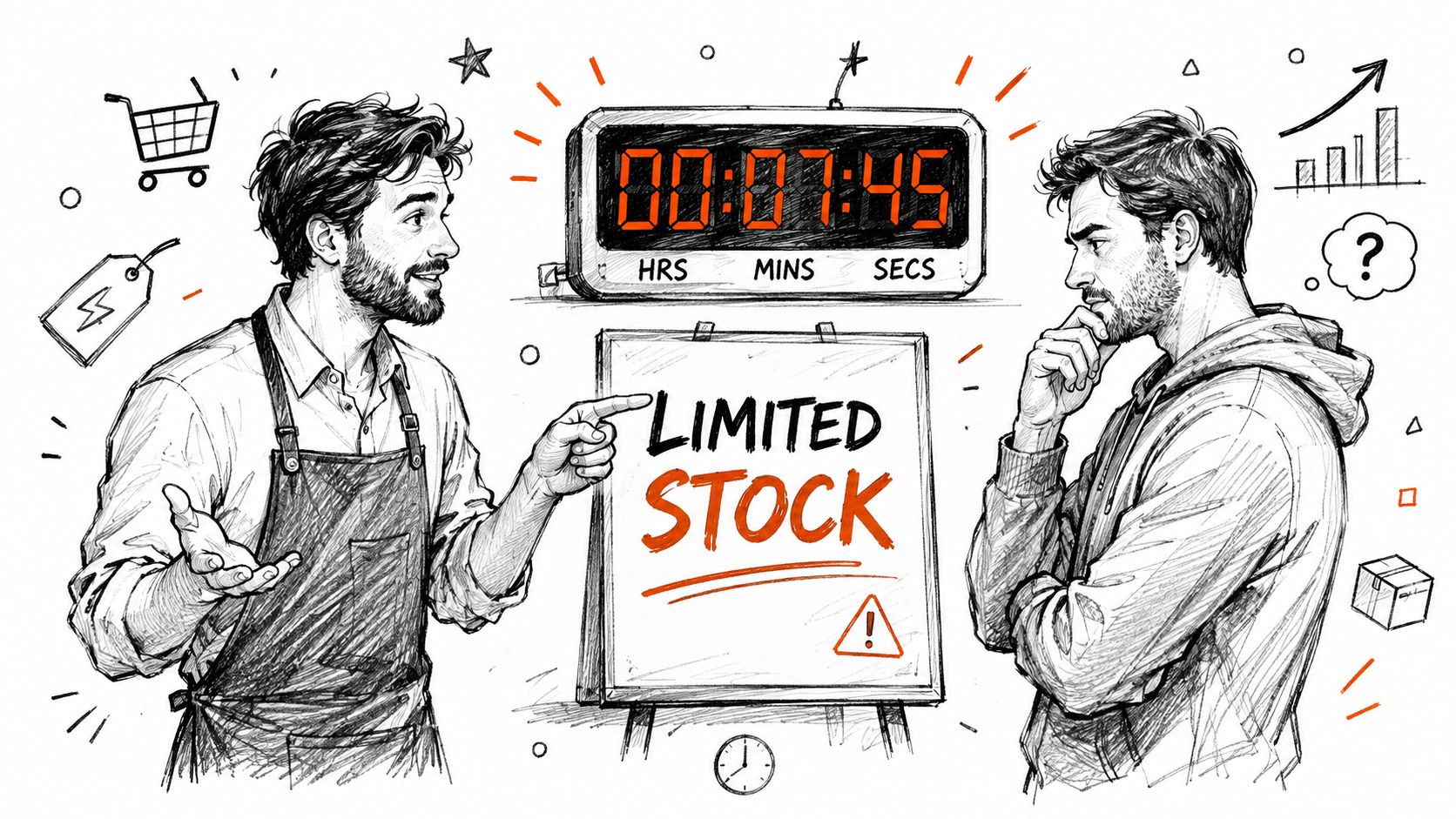
Urgency only earns attention when the constraint is real. If a countdown resets every time a shopper refreshes, or a stock badge never moves, people catch on fast. Once they see the pattern, the message loses credibility, and the next promo has to work harder just to be believed.
Real limits beat manufactured pressure
A capped reward, a time-bound claim window, or a descending tier that steps down as shoppers participate all create a real constraint. Those mechanics make the decision meaningful because the shopper can verify the limit through the experience itself. For a Shopify merchant, that is the difference between a promotion that shifts behavior and one that just adds noise.
Manufactured urgency does the opposite. It creates pressure now and skepticism later. That matters for margin because every fake deadline teaches customers to wait for the next fake deadline.
For merchants who want a tighter read on this mechanic, the Quikly guide to scarcity marketing is a useful reference point.
Urgency works when the offer can stand up to scrutiny
The honest version of urgency does not try to push people into buying something they do not want. It matches the offer to how shoppers decide. Most customers do better when the next step is clear and the window is limited, especially if the promotion is attached to a concrete benefit they can claim rather than a vague promise.
That distinction matters beyond the current campaign. Shoppers are better at filtering repetitive promo language, so a store that uses urgency sparingly and credibly usually earns more trust than one that splashes a countdown across every page. That trust shows up later, in repeat launches and in how much weight customers give the next offer.
Rule of thumb: if you would not defend the scarcity signal in front of a skeptical customer, do not put it on the page.
Earned urgency scales better than fake urgency
The strongest version is a mechanic the customer can participate in, not just observe. A claim-based reward, a tier that steps down, or a limited set of promotional slots tied to real demand creates motion without making the store look cheap. That is where how to boost conversions with CTAs becomes relevant, because the button should make the action obvious, not try to compensate for a weak offer.
If you want urgency to hold up under scrutiny, tie it to something the customer can verify, then keep the language plain. A real limit is enough. A fake one usually costs more than it returns.
An Implementation Checklist for a Small Team
Storefront
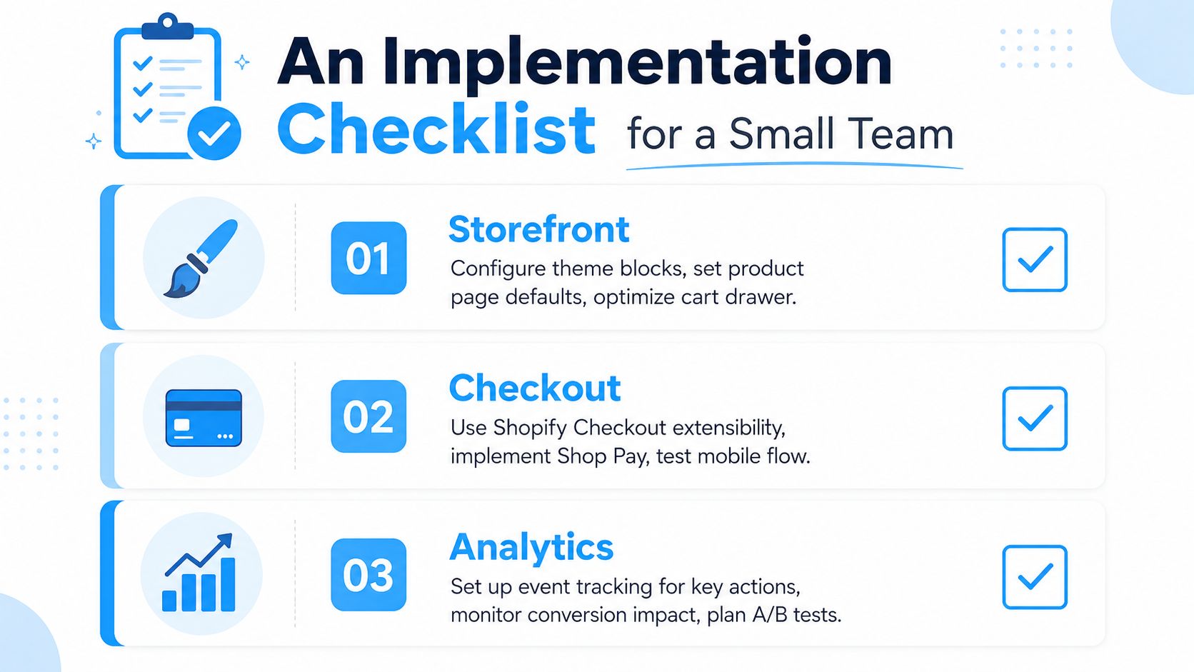
Start with the theme blocks you already control. Product page defaults, cart drawer prompts, and bundle presentation are usually the fastest wins because they sit closest to the decision. If you can make the shopper’s next move more obvious without adding clutter, you’re using the architecture well.
For a Shopify Plus merchant, checkout extensibility and scripts can support more advanced paths, but the basic principle stays the same. Clean the decision surface before you add complexity. A smaller team usually gets more from better defaults than from a larger feature stack.
Checkout
Checkout is where friction gets expensive. Shop Pay, address validation, and a sensible mobile path matter because checkout hesitation often has nothing to do with the offer itself. It’s just the wrong amount of effort at the wrong moment.
Lifecycle
Email and SMS should reinforce the same structure the storefront introduced. If a promotion rewards early action, the follow-up should mirror that logic instead of flattening it into a generic reminder. Klaviyo flows work best when the message matches the decision the shopper already made.
Analytics
Measurement needs to follow the architecture, not the other way around. Track the actual action you’re trying to shape, then inspect whether it happened at a better margin profile, not just at a higher order count. The second number matters as much as the first.
For a deeper framework on testing promo impact, the guide on how to measure marketing campaign effectiveness gives a useful measurement mindset, and a basic primer on A/B testing helps teams avoid confusing correlation with incrementality.
| Design pattern | Primary metric | Vanity trap | Guardrail metric |
|---|---|---|---|
| Product page defaults | Product-page progression | Total clicks on the page | Margin per order |
| Bundle framing | Bundle attach rate | Average order value alone | Margin per order |
| Friction reduction | Checkout completion | Traffic from paid campaigns | Incremental conversion |
| Earned incentive | Signup or claim rate | Gross orders during the promo window | Discount depth at conversion |
| Progressive disclosure | Variant selection completion | Time on page | Drop-off before cart |
Measure who benefits, not just whether the page moved
A 2024 review from the Behavioural Insights Team notes that online choice architecture can disproportionately affect consumers in vulnerable circumstances and recommends more research on underrepresented groups, more quantitative trials, and better data on vulnerability (Behavioural Insights Team review). That matters because a promotion can help some shoppers and leave others behind.
The same body of evidence also points to an equity upside. A study summarized by Temple University found that nudges improved choices more among lower-SES, lower-financial-literacy, and lower-numeracy consumers than among higher-SES groups. The design lesson is simple, segmenting by behavior and context can protect against one-size-fits-all promotion logic.
How to Measure Whether Choice Design Worked
The biggest measurement mistake is giving credit to anything that happened during the promotion window. If traffic rises, orders rise, and the team celebrates, you still do not know whether the design changed behavior or just captured demand that was already there.
The better question is whether the same offer, at the same discount depth, performed better because the choice environment improved. That is an incrementality question. It is also the cleanest way to tell whether you improved margin or just moved volume around.
Read AOV with margin attached
Average order value can improve for the wrong reason. A larger basket matters only if the extra revenue is not swallowed by a deeper discount or higher fulfillment cost. Read it next to margin per order, not in isolation.
Treat signup conversion as a leading indicator
If the promotion is meant to build a list or warm up future demand, signup rate matters. It is an early signal that the mechanic was strong enough to earn a next step. That matters when the purchase cycle runs longer than the first click.
Holdouts keep you honest
A holdout group shows what happened without the new choice design. Without that, you are mostly measuring traffic quality, seasonality, and luck. A clean test uses the same offer depth, then changes the architecture around it.
For teams that need a tighter read on performance, this guide to measuring campaign effectiveness is a useful companion to the promotion metrics here. It helps separate real lift from busy-looking results.
| Metrics That Move and Metrics to Ignore in Choice Design Tests |
| Design pattern | Primary metric | Vanity trap | Guardrail metric |
|---|---|---|---|
| Defaulted bundle | Bundle take rate | AOV alone | Margin per order |
| Urgency mechanic | Incremental conversion | Total promo orders | Discount depth |
| Cart simplification | Checkout completion | Paid traffic growth | Completion at same spend |
| Signup reward | Signup conversion | Social engagement | Future purchase rate |
The next question is who got helped. The evidence in the BI Team review shows that online choice architecture can affect vulnerable consumers differently, so a good test does not just ask whether the page changed. It asks which segment changed, and whether the change was fair, useful, and commercially sound.
If you want a clean read on the test itself, start with what is A/B testing. That framing keeps the merchant focused on comparing choices, not just watching a dashboard move.
Common Pitfalls and How to Avoid Them
The fastest way to ruin a good choice architecture program is to stack every nudge at once. Default, social proof, urgency, bundle framing, and a popup all hitting the shopper at once usually creates confusion, not conviction. A better move is to isolate one decision, improve that path, and leave the rest quiet.
The second mistake is celebrating conversion without checking margin per order. A store can look healthy while becoming more dependent on discount depth. If the only way to move product is to cut harder, the architecture is teaching customers to wait.
The third mistake is treating urgency like a one-off campaign. That turns scarcity into a gimmick and makes the next promotion harder to believe. A better structure uses urgency only where the constraint is real, visible, and repeatable.
Better decisions beat louder promotions.
That’s the standard. Choice architecture should help shoppers decide faster and help the brand protect margin, trust, and future demand at the same time. If a promotion can’t do both, it’s not solving the problem.
Quikly gives Shopify teams a way to run time- and quantity-bound promotions that people participate in, instead of passively dismiss. If you’re trying to improve conversion without training customers to wait for the next blanket discount, take a look at Quikly and see how a more deliberate promotion structure changes the decision path.
Topics: choice architecture, behavioral design, Shopify conversion, urgency marketing, DTC promotions