Behavioral design principles are psychology-backed tactics that shape how people make purchasing decisions by aligning promotions with natural cognitive biases. Reducing friction, loss aversion, and clear choice architecture matter because people often pick the easiest option, and small barriers can suppress action even when intent is already there.
That’s the practical reality for a Shopify operator right now. You can push harder with deeper discounts, but that usually means thinner margin, more promo fatigue, and customers who learn to wait instead of buy.
The Promotion Problem Shopify Brands Face Today
A lot of Shopify brands are stuck in the same loop. They need the sale, so they discount. The discount moves some inventory, but it also trains shoppers to expect a better deal later, which makes the next campaign harder to run and less profitable to keep running. That’s the margin problem, and it’s not theoretical.
The second problem is conversion. Brands spend on acquisition, bring in traffic, and still watch visitors hesitate at the last step. When the promotion is just a flat markdown, the offer doesn’t always create a reason to act now. It creates a reason to compare, bookmark, and come back later.
There’s a cleaner way to think about the job. Behavioral design doesn’t start with “How do we discount more?” It starts with “What makes this shopper act?” That shift matters because the strongest behavioral design principles work with how people naturally decide, not against it.
For brands dealing with promo fatigue, that distinction is everything. A promotion can be designed to protect margin and still move behavior if it respects the way attention, effort, and urgency work. If you want a good companion piece on why shoppers tune out repetitive promotions, this overview of psychological factors in promotion fatigue is a useful read.
Core Behavioral Design Principles Defined
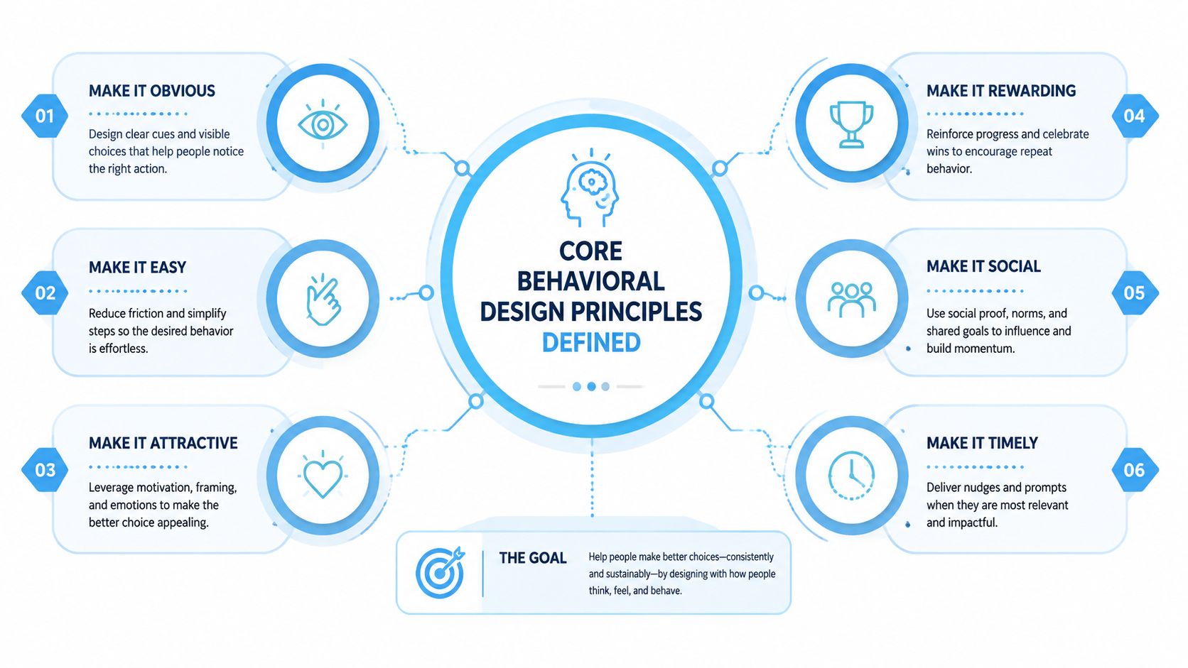
These principles are easier to use once you stop treating them like abstract theory. They’re practical shortcuts for how people choose under pressure, with limited attention, and usually less patience than marketers hope for.
Scarcity and urgency
Scarcity means something feels more valuable when it’s limited. If only a few units are available, people pay more attention because the chance may disappear. In ecommerce, that can be a product drop, a capped reward, or a limited release that feels worth acting on now.
Urgency is the time version of the same idea. A shopper doesn’t just ask, “Do I want this?” They ask, “Do I need to decide right now?” A time-bound offer works when it creates a real decision point, not just background noise.
Social proof and commitment
Social proof is the habit of looking to other people when a choice feels uncertain. If other shoppers, customers, or peers seem to be choosing something, the decision feels safer. That’s why reviews, ratings, and visible participation can matter more than polished copy.
Commitment and consistency means people like to stay aligned with what they’ve already done. A small action, like signing up, selecting a preference, or joining a waitlist, makes the next step feel more natural. Placing a foot on the path makes walking the rest of it feel like the natural progression.
Loss aversion, defaults, and framing
Loss aversion is the tendency to feel a missed opportunity more strongly than an equivalent gain. In plain language, people often respond more quickly to the thought of losing access than to the promise of gaining something later. That’s why “don’t miss out” can feel more activating than “save a little.”
Defaults are pre-set choices. People often stick with them because choosing the easiest option saves effort. In ecommerce, defaults show up in checkout flows, preselected delivery options, and even how offers are presented on-page.
Framing is how the same offer is described. A price can feel one way when it’s framed as savings, and another way when it’s framed as access, value, or timing. The underlying offer may be unchanged, but the decision feels different.
For a broader UX companion, the core design principles for customer loyalty resource from Wistec is a solid reference point for how structure shapes trust in digital experiences.
If you want a working example of how choice architecture affects the path to purchase, this choice architecture guide is a helpful follow-up.
Practical rule: don’t stack every principle into one message. A crowded promotion can feel manipulative before it feels motivating.
Why These Principles Work The Psychology Behind the Push
A shopper lands on a product page, hesitates, and keeps scrolling. The reason a small prompt can move that person better than a bigger discount is that the decision is already underway before they read every word. Behavioral science calls that fast, automatic mode of judgment System 1. The OECD’s behavioural-insights guidance explains that people make most choices automatically rather than deliberatively, so the way an offer is framed can change behaviour more than the size of the offer itself. A clear prompt lowers friction. A noisy one adds it. OECD behavioural-insights guidance
That same psychology explains why loss aversion shapes ecommerce behavior so strongly. Prospect theory, first developed by Daniel Kahneman and Amos Tversky in 1979, showed that people tend to react more strongly to a possible loss than to an equivalent gain. Earlier work on anchoring in 1974 showed that the first number or reference point can shape later judgment. In a store, the first frame a shopper sees often matters more than the final sentence in the promo copy.
The practical lesson is straightforward. A deeper discount says the price is lower. A better behavioral prompt says the opportunity is limited, the timing matters, or the shopper is giving up something by waiting. That difference protects margin because it changes the reason to act, instead of relying on a larger markdown to do the work. For a useful companion on how social influence shapes choice, see Sup Growth on social proof marketing.
Quikly’s own explanation of shopping behavior makes the same point from a different angle, which you can see in its behavioral science behind shopping behaviors. The shopper is not asking for more pressure. They are asking for less uncertainty.
That is also where ethics matters. Urgency and scarcity are persuasive only when they reflect real conditions, such as a live release, a limited batch, or a reward that changes at a specific time. Manufactured pressure may create a short-term spike, but it also teaches shoppers to distrust future offers. Earned urgency works more like a traffic light than a siren, it gives a clear signal at the point of choice.
The strongest behavioral design principles work because they reduce effort before they try to increase motivation. A prompt that clarifies the next step, removes ambiguity, or shortens the path to checkout often performs better than a blunt price cut. It asks less of the shopper’s attention, and it does so without eroding the brand’s margin.
Practical Ecommerce Examples From Theory to Storefront
A product drop is the clearest example of scarcity done well. If a brand releases a limited-run colorway or a small batch of a seasonal item, shoppers understand that waiting carries a cost. The offer feels earned because the limit is real, not decorative. That’s very different from a fake countdown that resets every visit and quickly trains people not to believe the clock.
Urgency works best when the deadline connects to a real business event, like a launch window, a live drop, or a reward that changes at a specific time. A time-bound offer can move a hesitant shopper because it turns “someday” into “now.” In checkout, that same logic can support faster action when the shopper sees a clear expiration rather than a vague sale banner.
For social proof, think beyond star ratings. A product page can show recent purchases, customer photos, or reviews that reflect the exact use case a shopper cares about. That reduces uncertainty because people see that others like them already chose the item.
Here’s where behavioral design becomes more interesting for operators. A brand can run a promotion that is time and quantity bound, so the shopper isn’t just receiving a discount, they’re participating in a limited opportunity. Quikly uses that model to create earned incentives, and it’s one of the few approaches in this category that doesn’t rely on blanket markdowns. It’s especially relevant when brands want to support conversion and average order value without teaching customers to wait for the next sale.
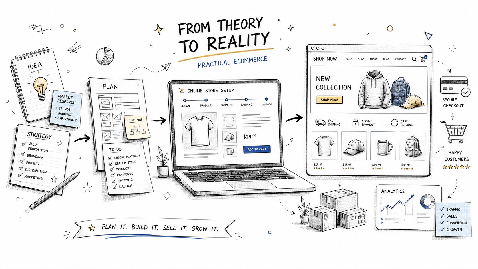
A few storefront patterns are especially useful:
- Loss-framed prompts: “Don’t miss your chance to claim this reward” works because it emphasizes what disappears.
- Default-friendly checkout choices: preselecting the most common delivery or bundle option reduces effort.
- Value framing: talk about what the customer gets access to, not only what they save.
- Commitment steps: email signup for an early offer can make the next action feel consistent, not forced.
If you’re reviewing the purchase path itself, this checkout page design guide is a practical companion for removing friction where it matters most.
Common Pitfalls When Behavioral Design Goes Wrong
The biggest mistake is using urgency when nothing is urgent. Shoppers notice when every offer is “limited,” every timer is fake, and every product is “almost gone.” Once that pattern repeats, trust drops and the message stops working. Behavioral design should clarify a real decision, not stage one.
Another trap is overusing scarcity until the brand feels stingy. When every product is framed as rare, customers stop believing the signal. That’s especially risky for Shopify brands that depend on repeat purchases, because the short-term win can weaken the long-term relationship.
There’s also a deeper ethical issue. Recent writing on behavioral design keeps coming back to the tension between persuasion and manipulation, and that tension is real. The line gets crossed when a prompt is optimized for conversion while hiding the tradeoff from the shopper. If the customer would feel tricked after the fact, the design needs a harder review.
The most responsible rule is simple. Use behavioral prompts to help shoppers decide, not to trap them.
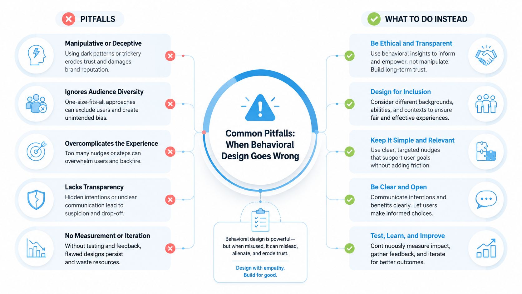
A few guardrails help:
- Keep the signal real: if the quantity is capped, cap it for real.
- Match the tone to the offer: don’t use panic language for a low-stakes decision.
- Preserve user agency: make the action clear, but don’t hide the exits.
- Leave room for reflection: some friction protects people from impulsive choices they’ll regret.
That last point matters more than most ecommerce teams admit. Not every barrier should be stripped away. In some cases, a small pause helps the shopper think, compare, or confirm the fit. Behavioral design is strongest when it respects the customer’s judgment, not when it tries to outrun it.
Testing and Measuring Your Behavioral Design Efforts
Behavioral design gets better when you treat it like a sequence, not a one-off campaign. Start with a single hypothesis, test one change at a time, and watch how people respond at the moment of choice. That’s how you learn whether the issue is attention, friction, framing, or something else entirely.
The cleanest way to do that is controlled testing. If you change the headline, the reward structure, and the checkout flow all at once, you won’t know which element moved behavior. Isolate one variable, then compare against a stable version of the page or promotion.
Track the metrics that reflect actual behaviour, not just clicks.
- Conversion rate: shows whether the prompt changed the purchase decision.
- Average order value: tells you whether the offer improved basket quality, not just volume.
- Cart abandonment: helps you spot where friction is still winning.
- Customer lifetime value: shows whether the promotion supports long-term value or only a short spike.
If you’re using Shopify analytics, email platforms like Klaviyo, or SMS tools, the job is connecting the offer to the downstream result. A campaign that converts quickly but attracts the wrong kind of buyer can still hurt the business. A campaign that converts at a lighter discount and keeps perceived value intact is usually the healthier trade.
Best test discipline: measure the smallest meaningful change first, then scale only what holds up in real traffic.
The broader behavioral-design literature recommends diagnosis, prototyping, piloting, and controlled experimentation for a reason. You’re trying to identify the barrier, not just decorate the page. When you do that well, you build a system that gets smarter with every campaign instead of a calendar full of random promotions.
Moving Forward Sustainable Growth Through Behavioral Design
Shopify brands don’t need more promotions that make the next sale harder to run. They need promotions that fit the way people already decide, protect margin, and keep the brand feeling worth paying for. That’s the value of behavioral design principles, they turn a promotion into a decision structure, not just a price change.
The smartest operators start small. They test one limited offer, one clearer frame, one cleaner path to action, then they watch what changes. Over time, that approach creates earned incentives instead of routine discounting, and earned incentives age much better than constant markdowns.
As ecommerce gets noisier, the brands that win won’t be the ones shouting loudest. They’ll be the ones that make the right action feel obvious, timely, and fair.
Quikly helps Shopify brands turn promotions into time- and quantity-bound experiences that shoppers actively participate in, instead of passively waiting to ignore. If you want to protect margin while giving customers a real reason to act now, visit Quikly and see how behavioral design can make your next promotion work harder without leaning on deeper discounts.
Topics: behavioral design principles, behavioral design, ecommerce conversion, scarcity principle, loss aversion