Traffic is up. Conversion is flat. The last promo needed a deeper discount just to keep revenue from sliding, and that’s the part nobody wants to say out loud: you’re not just fighting for clicks, you’re fighting to protect margin.
That’s why landing page optimization matters now. It’s the cheapest place in the funnel to fix intent mismatch, mobile friction, and offer confusion before you train customers to wait for the next markdown.
The Landing Page Problem You Are Actually Trying to Solve
Most Shopify teams think they have a conversion problem. They usually have a post-click problem.
A shopper saw the ad, opened the email, tapped the SMS link, and landed on a page that asked for too much attention, loaded too slowly, or buried the offer under generic merchandising. By the time that person decides whether to act, the page has already lost them. The fix is rarely “more discount.” It’s usually a tighter page that respects the click.
That’s why landing page optimization should start with one question: did the page make the right action obvious fast enough? If the answer is no, every paid visit, every email click, and every SMS tap gets more expensive than it should be. You’re paying to create intent, then leaking it on the page.
Practical rule: fix the landing page before you increase the discount. A clearer page usually protects more margin than a deeper promo ever will.
For ecommerce, this is especially important because the page isn’t just a design surface. It’s where your offer, your brand, and your economics all collide. A page that converts but attracts the wrong buyer, or converts only by overpaying with margin, is a bad page.
The right mindset is simple. Treat the landing page as a margin-protection asset, not a signup machine. The next sections break down what that means in practice, how to judge whether a page is effective, and where speed, mobile rendering, testing, and post-click quality fit into the picture.
What Landing Page Optimization Actually Means in Ecommerce
Landing page optimization in ecommerce means aligning one traffic source, one offer, and one conversion goal so the page matches why the visitor clicked in the first place. That’s different from homepage work, where the page has to serve multiple audiences and multiple jobs at once.
The benchmark matters because there is no universal “good” rate. Unbounce’s 2024 analysis covered approximately 41,000 landing pages, 464 million visitors, and 57 million conversions, and the median conversion rate was 6.6%, with industry medians ranging from 3.8% to 12.3% (Unbounce benchmark analysis). That spread is the point, good performance depends on the offer, traffic, device, and outcome you’re optimizing for.
For a Shopify merchant, the practical move is to define the page by job type:
- Campaign landing pages push one promotion, one product, or one timed offer.
- Product landing pages sell one item or one collection with a tighter decision path.
- List-building landing pages trade value for an email or SMS opt-in.
Each one needs a different success metric. A paid social campaign page should be judged differently from a search-driven product page, and both should be treated differently from a list-building page. If you use one blended site-wide rate, you’ll end up optimizing the wrong thing.
If you want a useful external reference point for structure and messaging, the practical SaaS guidance at practical SaaS landing page tips is a good reminder that clarity beats cleverness when the page has one job. The same logic applies on Shopify.
The core idea is not complicated. A landing page is good when it keeps the promise of the click and makes the next step obvious. Everything else is decoration unless it supports that job.
The Core Principles That Move a Landing Page
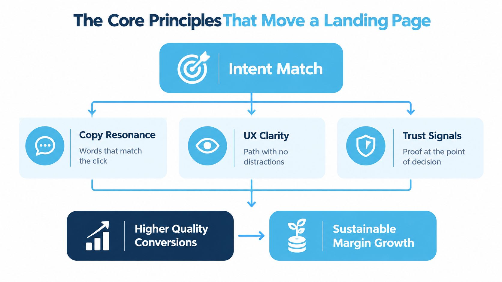
A landing page doesn’t need ten theories attached to it. It needs five decisions made well.
First, copy match matters. The headline and supporting copy should reflect the traffic source and the intent behind the click. If someone came from a product ad, don’t greet them with brand poetry. If they came from an SMS offer, don’t make them hunt for the reward.
Second, UX clarity wins over cleverness. The page should be easy to scan, easy to trust, and easy to act on. A singular clear CTA reduces bounce rate by about 12% compared with pages that carry multiple competing actions, and personalized landing-page content can lift conversion by around 19% on average (Nielsen Norman Group summary). That doesn’t mean personalization fixes bad offers. It means relevance and focus matter.
Third, the page needs a single primary action. More choices often mean less movement. If the page has a product CTA, a newsletter CTA, a “learn more” CTA, and a secondary promo all fighting for attention, the visitor has to do your prioritization for you. That’s usually where momentum dies.
A landing page should feel like a guided path, not a brochure with buttons.
Trade-offs, not commandments
The fourth principle is form friction. Ask for what the value justifies, and nothing more. A high-intent purchase page can ask for more than a simple email capture page, but every extra field should earn its place.
The fifth is trust signals near the action. Reviews, guarantee language, shipping clarity, return policies, or eligibility details work best when they’re close to the CTA they support. Trust that sits too far from the decision point might as well not exist.
These are trade-offs, not rules carved in stone. A longer page can work when the offer is complex. A shorter page can underperform when the buyer needs proof. The job is to align the page with the decision, then keep every element on that page pulling in the same direction.
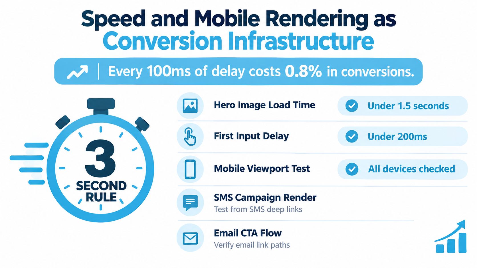
Speed and Mobile Rendering as Conversion Infrastructure
A slow page doesn’t just feel sloppy. It burns intent.
The shopper who taps an email or SMS promotion is often acting inside a narrow decision window. If the page stalls before the reward, the deadline, or the product benefit even appears, you’ve already lost the moment you paid for. That’s why speed belongs in the offer conversation, not in a separate technical bucket.
The stakes are real. Research cited in industry coverage found that ecommerce pages loading in 1 second converted at about 2.5 times the rate of pages loading in 5 seconds, and a separate Google mobile finding reported that a 1-second delay can reduce mobile conversions by up to 20% (landing-page speed research summary). Google’s mobile site speed playbook also reports that mobile pages loading one second faster achieved up to a 27% increase in conversion rates (Google Mobile Site Speed Playbook).
So stop treating speed as a later-stage optimization task. Ship the offer page like it matters.
What to tighten on a Shopify page
- Compress oversized images. A hero image that looks premium on desktop can become a liability on mobile.
- Defer nonessential scripts. Third-party tags, app code, and decorative widgets all compete with the first render.
- Prioritize above-the-fold content. The offer, value proposition, and CTA should appear before anything ornamental.
- Test on real mobile connections. A fast office network hides problems that shoppers on mobile data will feel immediately.
- Check deep-link behavior from SMS and email. If the page behaves badly after the tap, the channel loses efficiency.
The urgency problem gets worse when the page is slow. If your scarcity message appears after the visitor has already bounced, the tactic never gets a chance to work. For a practical mobile optimization checklist, the guide at mobile conversion optimization is a useful reference point.
Practical rule: if the promotion depends on urgency, the page has to render the urgency first.
That’s the standard. Not perfect performance, just fast enough that the offer arrives before attention disappears.
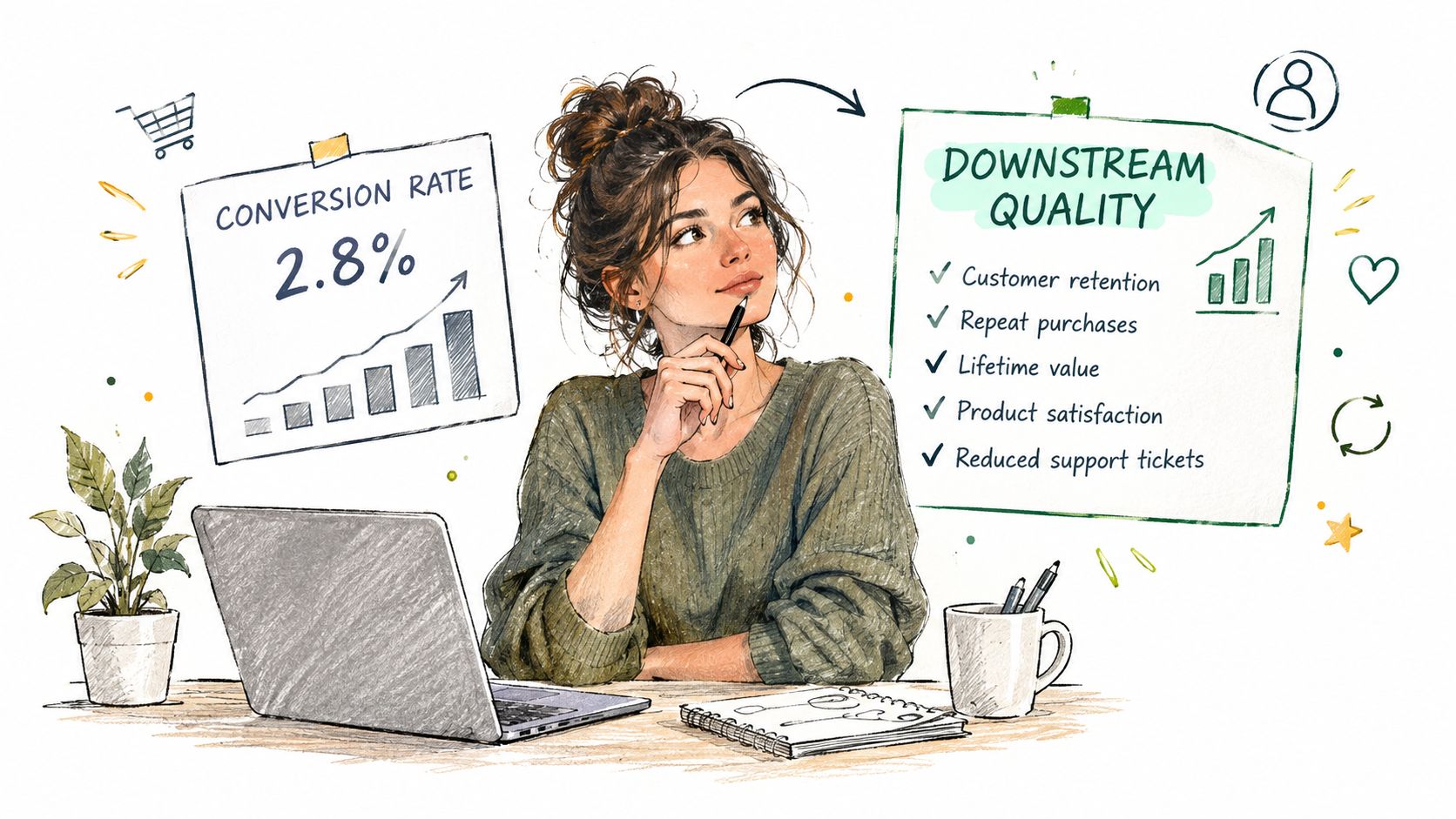
Measure Downstream Quality, Not Just the Conversion Rate
A landing page can “win” and still make the business worse.
That happens when the page pulls in low-intent signups, discount hunters, or shallow buyers who never come back. The surface metric looks good. The economics are rotten. Too many teams fool themselves with a clean conversion dashboard and a dirty margin story.
The benchmark spread already tells you why the headline number is unstable. One source reports a 6.6% median across 41,000 landing pages and 57 million conversions, while ecommerce-specific guidance cites roughly 2.4% median conversion and 8.3% for top performers (WebMedic guidance). Different offers, traffic sources, and conversion definitions produce different “good” rates. Chasing the number without context is how teams optimize the wrong thing.
The guardrails that belong in every report
Use one primary metric, then add guardrails that protect the business:
- Profit per visitor, not just conversion rate.
- Average order value, especially on promotion pages.
- Refund or cancellation rate, because cheap intent often reverses later.
- Qualified subscriber rate, if the page is capturing email or SMS.
- 30- or 60-day repeat purchase, if the offer is meant to build customers, not one-off bargain behavior.
If you’re looking for a broader framework on how teams should think about these metrics, turn more visitors into buyers is a useful complement because it keeps the conversion conversation tied to commercial quality.
Why this matters on urgency-led pages
A constraint-based offer should be judged on whether it changes timing and quality, not just claim volume. If a page forces faster decisions without crushing margin or dragging down repeat value, it’s doing its job. If it buys cheap orders that never stick, it isn’t.
Sharp test: a lower conversion rate can be the better page if it filters out low-value demand and lifts profit per visitor.
If you need a deeper metrics lens for ecommerce reporting, the internal guide at https://hello.quikly.com/blog/ecommerce-performance-metrics is the right companion piece. A page that protects quality is usually the page you want to scale.
A Practical A/B and Multivariate Testing Framework
The average marketing team doesn’t need more testing. They need better testing discipline.
A/B testing is the right call when you have one meaningful change and enough traffic to read it cleanly. Multivariate testing is useful when the page has multiple interacting elements and enough volume to support combinations. If you don’t have that traffic, don’t fake certainty. Run fewer tests and learn faster from each one.
How to write a test that actually teaches you something
Start with one customer behavior, one page element, and one expected effect. For example, “If we reduce headline ambiguity on the SMS landing page, more visitors will click the primary CTA.” That’s a hypothesis. “Try a different headline” is not.
Then define the metric setup before launch:
- Primary metric. Pick the one outcome the test is meant to move.
- Guardrails. Add one or two measures that stop a bad win from shipping.
- Stopping rule. Decide in advance whether you’ll run to significance or to a pre-set duration.
- Documentation. Write down the result, the context, and what to test next.
If you’re building the team habit around sample size and test duration, the internal note at https://hello.quikly.com/blog/sample-size-calculation is worth keeping close.
Don’t let a weak test decide a strong business change.
Choosing the right test type
| Scenario | Better fit | Why |
|---|---|---|
| One headline change on a paid social landing page | A/B test | Clean read, one main variable |
| Several page elements interact on a high-traffic product page | Multivariate test | Lets you see combined effects |
| Low-traffic campaign page | A/B test or no test yet | MVT usually wastes traffic |
| Checkout friction issue after the CTA | Separate funnel test | The landing page isn’t the only problem |
For teams that want a structured CRO lens beyond ecommerce basics, the CRO framework for Australian firms is a useful reference because it treats testing as a process, not a lucky guess.
The point of testing is not to squeeze every page for immediate revenue. It’s to validate a change worth shipping or kill a bad idea quickly enough to move on. That’s how small teams compound learning without burning traffic.
When Flat Discounts and When Real Scarcity
A flat discount is easy to understand. That doesn’t make it smart.
If you run the same percentage-off offer to everyone for a week, you get predictable response and predictable margin pressure. It’s the default move because it’s simple to launch, not because it’s the best commercial decision. Most stores already know that game, and customers do too.
A time- or quantity-bound offer changes the psychology. The shopper isn’t just receiving a price cut, they’re deciding whether to claim a limited reward before it disappears. That matters because urgency and perceived savings influence purchase intention, while discount size alone doesn’t necessarily do the work. A 2026 behavioral-pricing study reported a positive urgency coefficient of β = 0.329 with p < 0.001 (study PDF).
How to choose the right promotion style
Use a flat discount when the job is broad clearance, simple list-wide demand generation, or a straightforward seasonal push. Use real scarcity when you need faster action, better margin discipline, or a more selective reward structure.
That’s where a tool like Quikly fits naturally. It turns a promotion into a time- or quantity-bound experience, so the reward goes to shoppers who act while the offer is still open. That’s different from blasting the same markdown to everyone and hoping urgency appears by itself.
The biggest mistake is fake scarcity. If the claim isn’t operationally real, trust takes the hit and the tactic becomes noise. Real scarcity has to be visible, truthful, and tied to a genuine constraint.
Scarcity works when it clarifies the decision. It fails when it looks manufactured.
So don’t ask, “How high should the discount be?” Ask, “What’s the smallest real incentive that gets the right shoppers to act now?” Sometimes the answer is a lower reward with a better deadline. Sometimes the best page is the one that doesn’t lean on a blanket discount at all.
Your Landing Page Optimization Checklist
Use this before the next launch.
Launch checklist
- Match the page to one traffic source. Don’t make one page do the work of three campaigns.
- State the offer immediately. The first screen should make the reward and the action obvious.
- Keep one primary CTA. Secondary actions dilute the decision.
- Place trust signals near the button. Proof works best when it sits close to the click.
- Cut form fields to the value exchange. Every field should earn its spot.
- Treat mobile as the default view. If the page is awkward one-handed, it isn’t finished.
- Test speed on real connections. Desktop comfort can hide mobile frustration.
- Track downstream quality from day one. Measure profit per visitor, AOV, refunds, and repeat purchase, not just conversion.
- Run one test at a time when traffic is limited. Fast learning beats noisy guessing.
- Protect the checkout. Landing page gains are wasted if the path after the CTA falls apart.
Baymard’s checkout research found that 65% of leading US and European ecommerce sites performed at a mediocre level or worse in checkout UX, while only 2% were rated good, and it estimated that the average large ecommerce site could achieve a 35% conversion-rate increase through checkout design improvements alone (Baymard checkout benchmark). That’s the reminder every team needs. The landing page is not the whole funnel.
The job itself is simpler than the industry makes it sound. Match intent, keep the page fast, measure quality, and use urgency only when the constraint is real. That’s how you protect conversions without teaching the market to wait for a better discount.
If you want a sharper way to run urgency without defaulting to deeper markdowns, visit Quikly and see how real time- and quantity-bound promotions fit into a Shopify stack. It’s a cleaner way to turn intent into action while keeping margin, brand value, and the landing page experience intact.
Topics: landing page optimization, ecommerce conversion, A/B testing, Shopify CRO, page speed