Most customer journey mapping advice gets the order wrong. Teams are told to build the map, make it pretty, and share it around, as if the artifact itself creates change. In practice, the map only matters when it tells a Shopify team what to fix first, what to ignore, and what to test on the storefront, in checkout, and in lifecycle flows.
That distinction matters because margin pressure doesn’t leave much room for decorative strategy. A map that ends as a workshop output doesn’t improve conversion, protect brand value, or reduce the reflex to reach for deeper discounts. The useful version is a working hypothesis, one that points to real friction and turns it into an action plan.
Why Most Customer Journey Maps End Up on a Shelf
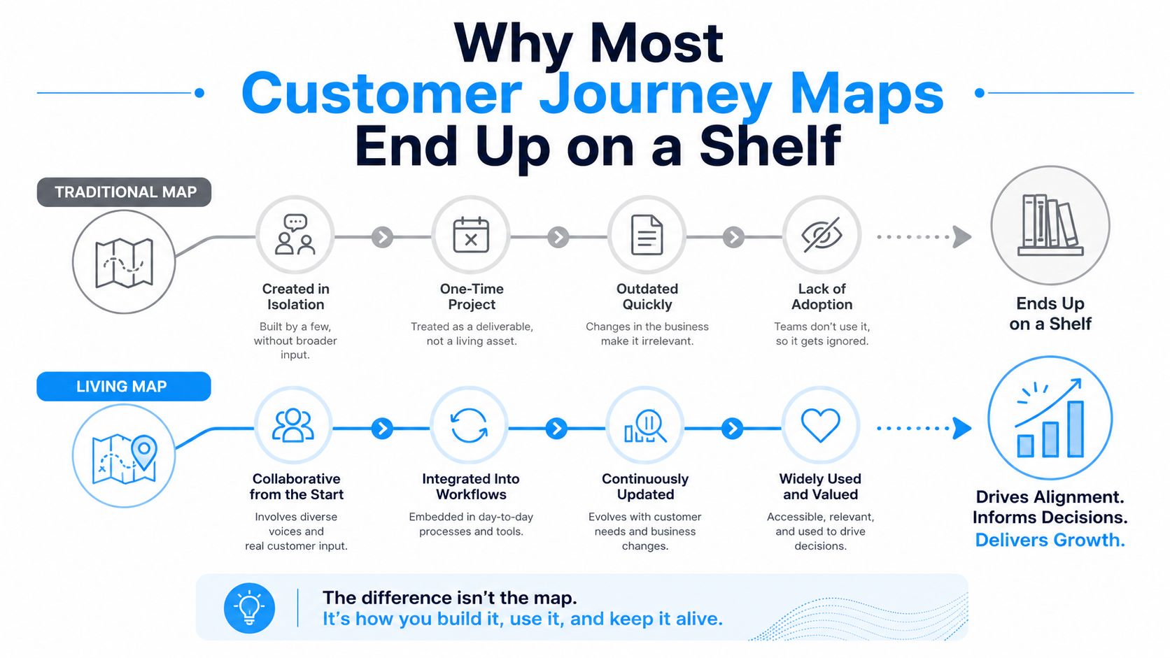
The fastest way to waste a customer journey map is to treat the map as the deliverable. That’s how teams end up with a polished poster that names every touchpoint, every emotion, and every channel, but never answers the only question that matters, which friction gets fixed first.
A shelf-worthy map usually looks impressive in the room and useless in the business. It captures the journey as a static diagram, then gets filed away when the meeting ends. The teams that extract value treat the map as a testable hypothesis, not a final answer.
The real output is a ranked fix list
A useful map produces a short list of decisions. It tells the team which blockers are hurting conversion, which moments are creating unnecessary hesitation, and which changes are worth shipping this quarter instead of next year.
That’s why a guide like Up North Media’s journey mapping guide is worth keeping nearby if you’re comparing formats. The point isn’t to collect more map styles, it’s to build something that changes what happens in the cart, on PDPs, and in email or SMS after the purchase.
Practical rule: if a map doesn’t change a backlog, it’s decoration.
That mindset also changes how you measure the work. Instead of asking whether the map looks complete, ask whether it’s leading to cleaner test design, clearer ownership, and better campaign decisions. A team that can connect mapping to outcome tracking has a real operating system, not just a workshop artifact, and this measure campaign effectiveness guide is a useful companion if you want the accountability to match the strategy.
Scope Before You Sketch a Single Stage
A broad map is usually a bad map. Nielsen Norman Group advises establishing the why and the what first, while Smaply recommends one persona, one journey, one goal, and one purpose before mapping anything else, because a wide-open exercise tends to turn into a wall of observations instead of a decision tool.
That discipline matters in ecommerce because every store has too many possible journeys. A first-time buyer who lands from paid social and abandons at checkout is a very different problem from a repeat customer who hasn’t purchased in 90 days, and both are different again from a high-AOV shopper moving from collection page to product page to cart. A single map shouldn’t try to solve all three at once.
Write the scope in one sentence
A clean scope statement forces clarity. It should name the persona, the journey, and the business objective in plain language, such as reducing abandonment for first-time mobile buyers or improving repeat purchase behavior for lapsed customers.
The more precise the scope, the easier it is to defend when stakeholders want to add every edge case. That’s not stubbornness, it’s practicality. If the map is supposed to guide action, it needs a narrow lane where action is possible.
For Shopify brands, the best first journeys are usually the ones with visible friction and obvious business impact. Common starting points include:
- First-time acquisition checkout: a new shopper arrives from paid social, browses, and drops at payment or shipping.
- Lapsed customer reactivation: a past buyer goes quiet and needs a reason to return without training them to wait for a heavy discount.
- High-intent product path: a shopper moves from collection page to PDP to cart, then stalls on reassurance.
A tight scope doesn’t reduce ambition, it makes the work usable.
Once the scope is defined, every later step gets sharper. Research becomes easier to compare, touchpoints become easier to rank, and the final map becomes a tool for action rather than a catalog of customer behavior. That’s the version teams revisit.
Build the Map From Evidence, Not Brainstorms
A defensible map starts with data you already trust, not a whiteboard full of opinions. Smaply recommends beginning with analytics, survey results, support tickets, NPS scores, and prior research, then triangulating findings with three or more sources before treating them as reliable, and attaching pain points to evidence such as interview quotes, data points, or support-ticket patterns.
That logic is especially important for ecommerce teams because isolated feedback can mislead you. A single loud support complaint might point to a real issue, or it might be a one-off. When the same friction shows up in analytics, tickets, and interviews, you can act with much more confidence.
Use mixed evidence, not one signal
For a Shopify brand, a practical evidence kit usually includes qualitative and quantitative inputs side by side. Interviews tell you what shoppers think they’re experiencing, while platform data tells you where the journey breaks.
Teams should pull from:
- Shopify analytics views that show product-page behavior, add-to-cart movement, and checkout drop-off.
- Support tickets that reveal repeated confusion, especially around shipping, returns, or payment.
- Session replays and heatmaps that show where shoppers hesitate, scroll back, or miss calls to action.
- Klaviyo or SMS engagement that shows whether lifecycle messages are landing or being ignored.
- Search-on-site logs that surface intent the navigation didn’t satisfy.
A first map doesn’t need a giant research program. It needs enough evidence to spot the same friction from multiple angles. Once that happens, the map becomes something the team can defend and update, not something they have to apologize for later.
Make the evidence visible on the map
Each pain point should carry a source note, not just a label. If a checkout issue came from support tickets and session replays, write that down next to the friction so the team knows why it exists and whether the signal is strong enough to prioritize.
The same principle applies to interviews. The most useful quotes are the ones that explain hesitation in the shopper’s own words. They make the problem legible to merchandising, CX, and lifecycle teams without forcing everyone to interpret the same raw data from scratch.
For a deeper field guide on triangulating qualitative inputs, this qualitative customer research guide is a useful reference. It fits well with a map that needs to be evidence-led instead of assumption-led.
Map the Stages and Touchpoints Ecommerce Teams Actually See
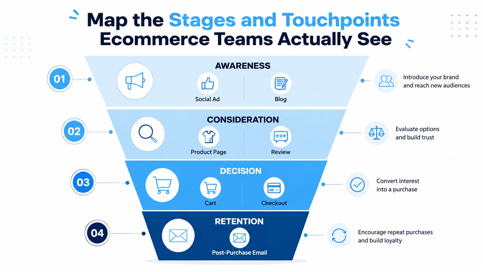
A journey map gets more useful when it follows the full lifecycle instead of stopping at conversion. Best-practice sources stress capturing the customer’s thoughts and emotions at each step, because moments of truth are the interactions most likely to shape perception and reveal drop-off or support opportunities, and common stage models include awareness, consideration, decision or purchase, post-purchase, retention, and advocacy. glance.cx
That lifecycle lens matters for Shopify brands because purchase is not the finish line. It’s one stage in a longer relationship that includes post-purchase reassurance, repeat buying, and advocacy through reviews or referrals.
Stage by stage, the map should show what shoppers do
At awareness, shoppers might encounter a paid social ad, an influencer post, or a blog article. At consideration, they move to product pages, reviews, comparison content, or on-site search. In decision and purchase, the key touchpoints become cart, checkout, and shipping information.
Post-purchase starts after the order is placed, where email, SMS, tracking pages, and support interactions shape whether the buyer feels confident or forgotten. Retention depends on reorder nudges, replenishment flows, and helpful follow-up, while advocacy appears in review requests, referral prompts, and loyalty engagement. The stage labels matter less than whether the touchpoints match the way your store operates.
Capture thoughts, feelings, and channel transitions
A strong map doesn’t just list interactions. It records what the customer is thinking, what they’re feeling, and where the channel shifts create risk. A shopper moving from ad to site is one moment of truth, and cart to checkout is another.
Those transitions deserve extra attention because intent is high and hesitation is expensive. When the map marks those moments clearly, it becomes easier to see where reassurance, clarity, or a different promotion mechanic might be more effective than a blunt discount.
The best maps show movement, not just milestones.
The practical payoff is simple. Teams stop arguing about abstract journey stages and start seeing the actual friction points in their own storefront, email, and SMS ecosystem. That’s the level of detail a Shopify operator can work with.
Prioritize Friction by Revenue Impact, Not by Volume
Most journey mapping guides stop after identification, which is exactly where the hard work begins. Nielsen Norman Group specifically recommends analyzing maps for low and high points, failures to set expectations, unnecessary or overly long steps, channel transitions, and moments of truth, while IBM and Adobe frame validation and action as separate steps after mapping, leaving prioritization as an underserved step. nngroup.com
That gap matters because not every pain point deserves the same level of attention. The issue that appears most often isn’t always the issue that costs the most money, frustrates the most valuable shopper, or can be fixed fastest.
Use three filters to rank the work
A simple prioritization model keeps the map from becoming a wish list. Score each friction point on three things, revenue impact, customer severity, and fixability.
Revenue impact asks how much conversion, AOV, or retention the issue touches. Customer severity asks how painful the problem feels from the shopper’s perspective. Fixability asks whether the team can realistically ship a solution within a quarter.
That mix keeps teams honest. A massive issue that’s hard to solve may still need a project plan, while a smaller issue that’s quick to fix may be worth testing immediately. The goal isn’t perfect certainty, it’s better sequencing.
Turn the top issues into owners and experiments
Once the list is ranked, assign owners across product, merchandising, lifecycle, and promotions. Some issues deserve a redesign. Others are better handled as tests, copy changes, FAQ updates, or campaign shifts.
A common ecommerce pattern is shipping uncertainty at checkout. If the map shows that shoppers stall because delivery timing feels vague, the fix might include clearer checkout copy, a shipping FAQ page, and a behavior-led incentive that rewards urgency without deepening the discount. That’s a more disciplined answer than defaulting to a blanket markdown.
For a Shopify team, the top five to ten friction points are usually enough to start. Anything below that often belongs in a later review cycle unless it’s cheap to fix or tied to a major revenue leak.
| Prioritization factor | What to ask | Why it matters |
|---|---|---|
| Revenue impact | Does this affect conversion, AOV, or retention? | Keeps the team focused on business outcomes |
| Customer severity | How frustrating is this for the shopper? | Prevents the team from minimizing real pain |
| Fixability | Can we ship a credible test this quarter? | Avoids endless strategy with no execution |
Turn Findings Into Behavior-Led Promotions That Don’t Erode Margin
A journey map should change the shape of the promotion, not just the timing of it. If the insight says shoppers hesitate at the urgency moment, the answer doesn’t have to be a deeper discount. It can be a capped reward, a short window, or a declining tier that gives people a reason to act without training them to wait.
That matters because blanket discounting is easy, but it’s blunt. It can drive action in the short term while lowering perceived value over time. A better promotional mechanic aligns with how shoppers decide, especially when scarcity bias and loss aversion are doing the heavy lifting.
Use the map to match incentive to friction
The clearest promotional design comes from the friction itself. If the map shows that shoppers abandon because they’re unsure whether the offer will still be there later, a capped or time-bound reward fits that behavior better than a permanent markdown.
A behavior-led campaign also respects the store’s economics. Instead of giving the same deal to everyone, the brand can reward the people who move now, preserve margin for later, and keep the offer feeling earned rather than automatic. That’s a better fit for shoppers who respond to genuine scarcity and a better fit for the brand’s price integrity.
If the problem is hesitation, the fix should reward decisive behavior.
For a fashion brand with a strong email list and recurring abandonment, that usually means testing an incentive that exists for a short window or a fixed pool of claimers. The point isn’t to be louder. It’s to make the offer relevant at the exact moment the shopper is deciding.
The internal logic from the map is what keeps the campaign from becoming a generic flash sale. The team sees where the journey breaks, why the shopper hesitates, and which type of incentive is least likely to damage the brand while still moving conversion.
For a closer look at promotion design in an ecommerce context, this ecommerce promotions guide is a useful companion.
Measure, Iterate, and Stop Treating the Map as a One-Time Project
A map that never changes turns stale fast. Shopify merchants need to treat customer journey mapping as an ongoing operating practice, because shoppers move between search, social, email, SMS, marketplaces, apps, and in-store touchpoints with a lot less linearity than older funnel diagrams assume. Adobe’s guidance on effective maps points to that shift toward more fragmented and cross-channel behavior, which means the journey is now closer to a living instrument than a fixed flowchart. Adobe
That’s the right mental model for an ecommerce team. The map should be updated when behavior changes, not when someone finds time to revisit a pretty slide deck.
Tie each stage to a KPI and review rhythm
A map becomes operational when every stage feeds a metric the team already watches. Awareness should connect to consideration through click-through and site engagement. Consideration should connect to purchase through add-to-cart and checkout completion. Post-purchase should connect to retention through repeat rate, while advocacy should show up in review volume and referral activity.
The cadence matters too. A quarterly review is enough for teams to pull fresh analytics, refresh the friction list, run one or two experiments, and update the map only where behavior has shifted. That keeps the work tied to reality instead of opinion drift.
Keep the map alive as buying behavior changes
The most useful maps aren’t perfect. They’re current. When shoppers switch devices, revisit comparison content, or come back through a different channel, the map should reflect that behavior instead of forcing it into an old sequence.
That’s especially important for Shopify brands that are trying to improve conversion without leaning harder on discounts. The map helps the team see where behavior-led promotions, content changes, or checkout fixes belong, and where they’d just be masking a deeper issue. If the team can keep that loop tight, the journey map stops being a project and becomes part of how the business learns.
If you want to turn journey insights into promotions shoppers act on, Quikly is built for that moment. It helps Shopify brands create capped, time-bound, on-brand urgency experiences that reward the people who move now instead of the ones who wait. Visit Quikly if you want a promotion mechanic that fits the map you just built and protects the margin behind it.
Topics: customer journey mapping, ecommerce journey map, journey mapping, touchpoints, Shopify