A shopper lands on your Shopify store after seeing a premium option somewhere else. Suddenly, a mid-tier product feels reasonable. Another shopper sees your steepest discount first, then ignores the rest of the collection because everything else now feels overpriced. Same brain. Same mechanism. Different commercial outcome.
That mechanism is the contrast effect. It shapes how customers read price, value, quality, urgency, and even whether an offer feels worth acting on. For merchants, that makes it powerful. It also makes it dangerous.
Used well, contrast helps customers make faster, clearer decisions. Used lazily, it turns your promo calendar into a treadmill of strike-through prices, deeper markdowns, and shrinking trust. If you’re running a Shopify store and feeling the pressure of weak conversion, promo fatigue, and margin erosion at the same time, this is one psychological principle worth understanding properly.
Your Brain on Autopilot
You’ve felt the contrast effect even if you’ve never named it.
A $5,000 handbag makes the $500 one feel accessible. A luxury hotel suite makes the standard room look practical. A high-end sofa in a showroom changes how you judge the one next to it. Nothing about the second item changed on its own. Your perception changed because of what came before or sat beside it.
That’s the simple answer to what is the contrast effect. It’s a cognitive bias where the perception of an item or attribute is distorted by comparing it to a preceding or simultaneous stimulus that is noticeably different, causing the item to appear more or less appealing than it objectively is. That definition shows up clearly in this contrast effect overview from Conversion Uplift.
In ecommerce, customers make these relative judgments constantly. They compare your first visible price to your second. They compare your hero product to the adjacent card in a collection grid. They compare this week’s offer to last month’s better one. If you want a broader view of how these decision shortcuts connect to purchase hesitation, CartBoss has useful insights into e-commerce cart psychology that map closely to what merchants see at checkout.
Where merchants go wrong
Most stores use contrast in the most obvious way possible. They put a higher “was” price next to a lower “now” price and hope the gap does all the work.
Sometimes it does. Over time, it often backfires.
When every campaign relies on price contrast, customers stop reading the offer as special. They read it as routine. That’s where promo fatigue starts. The more familiar your markdown pattern becomes, the less persuasive it feels, and the harder you have to push next time.
Practical rule: If your only contrast is “higher old price, lower new price,” you’re teaching shoppers to compare you against your own discount history.
For Shopify merchants, that problem gets expensive fast. Acquisition costs don’t care that your margin is thinner. Customers who’ve learned your rhythm wait for the next code. Brand perception slips from intentional to promotional. If you want a stronger foundation for behavior-driven merchandising, Quikly’s article on ecommerce psychology is a useful companion read.
The Psychology of Compared to What
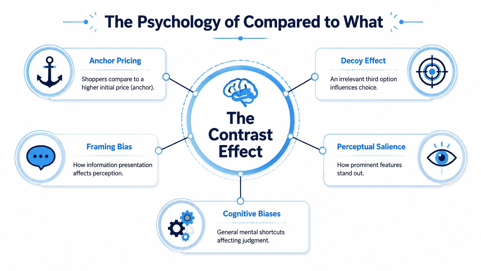
The contrast effect works because the brain rarely evaluates in a vacuum. It asks a faster question first. Compared to what?
Touch lukewarm water after holding ice, and it feels warm. Touch the same lukewarm water after hot water, and it feels cool. The stimulus is identical. The comparison point isn’t. Shopping decisions work the same way.
Simultaneous contrast
This happens when people evaluate options side by side.
A shopper sees three serum bundles on a product page. The premium bundle makes the middle bundle feel safer. A high-priced subscription plan next to a standard plan can make the standard plan look efficient rather than expensive. Side-by-side presentation sharpens differences because the comparison is immediate.
A classic finding matters here. In a 1995 controlled experiment by Wedell, researchers found that contrast effects were significantly greater for simultaneous presentations than for sequential ones, confirming that direct juxtaposition amplifies perceived difference. That’s highly relevant to collection layouts, pricing tables, upsell modules, and bundle blocks on Shopify storefronts.
Successive contrast
This happens over time.
A customer sees one offer, then another. The first becomes the reference point for the second. That sequence changes how the second offer feels, even if its standalone value hasn’t changed.
That’s why campaign order matters. A strong VIP offer sent first can make a weaker sitewide follow-up feel flat. A premium product ad can make a later mid-tier retargeting ad feel more attainable. Sequence is part of the offer.
This isn’t just theory
The mistake many marketers make is treating contrast like a clever pricing trick. It’s not. It’s a basic feature of human judgment.
Research also suggests these distortions in ratings are tied to how people process comparisons and responses, not just what they visually perceive, as noted in this contrast-effect research summary on ScienceDirect. In practice, that means your merchandising choices don’t just color perception for a second. They can change the decision that follows.
The reference point often matters almost as much as the offer itself.
That’s why the best operators don’t ask only whether an offer is good. They ask what the customer saw right before it, beside it, and instead of it. If you want a related lens on how framing influences purchase decisions, Quikly’s piece on the psychology of persuasion and helping customers make decisions is worth reading.
How the Contrast Effect Shapes Online Shopping
Contrast is all over ecommerce. Some of it is deliberate. Some of it leaks in through page layout, campaign sequencing, and app clutter. Either way, it changes how shoppers interpret value.
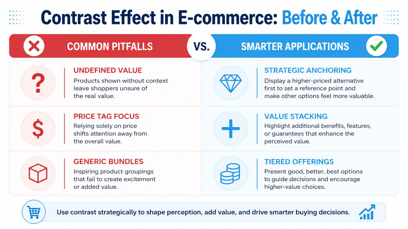
Anchoring with a premium option
One of the cleanest uses is premium anchoring.
If you sell coffee gear, showing a higher-end grinder next to a mid-tier one can make the mid-tier product feel like the sensible choice. If you sell skincare, a premium regimen can make a two-product starter set look efficient rather than limited. The point isn’t to force everyone into the top tier. It’s to shape how the middle gets interpreted.
This works best when items are clearly related. The contrast effect is strongest when options share the same base category but differ in intensity or level. That’s part of why pricing psychology leans on controlled comparison. The principle is described in this contrast effect overview, which notes that the effect operates through simultaneous and successive exposure and highlights the familiar example of a $2,000 item placed next to a $4,000 item.
Decoy pricing and tiered choice
Then there’s the decoy pattern.
A merchant offers three plans or bundles. One is weak by design. Its job isn’t to sell. Its job is to make another option look stronger. Think of a poor-value middle subscription that exists mainly to make the premium tier feel like the better trade.
This can work. But merchants often overdo it.
If the decoy looks fake, shoppers notice. If the tiers aren’t meaningfully differentiated, the page starts to feel manipulative instead of helpful. On Shopify, this happens a lot with subscription widgets, bundle builders, and app-generated pricing tables that look mathematically clever but emotionally thin.
Strike-through pricing and the race to the bottom
The most common use of contrast is still strike-through pricing.
| Tactic | What the shopper compares | Risk |
|---|---|---|
| Premium anchor | One product against a more expensive related option | Can feel irrelevant if the premium item isn’t credible |
| Decoy tier | One plan against a weaker alternative | Can damage trust if the decoy feels artificial |
| Was-now pricing | Current price against past or reference price | Can create discount dependence |
The problem isn’t that strike-through pricing never works. The problem is that many brands use it as their only lever.
Merchant reality: Price contrast is easy to launch and hard to sustain.
If every email, PDP, and paid social ad leads with a markdown, the customer’s comparison habit gets stronger. They stop asking, “Do I want this?” and start asking, “Will it be cheaper next week?” That shift hurts more than conversion rate. It changes buying behavior in a way that bleeds margin and weakens perceived value.
For Shopify teams, that’s the primary issue. The contrast effect can increase action. But if the only contrast you create is cheaper versus less cheap, you’re building a promotional system that trains customers to wait.
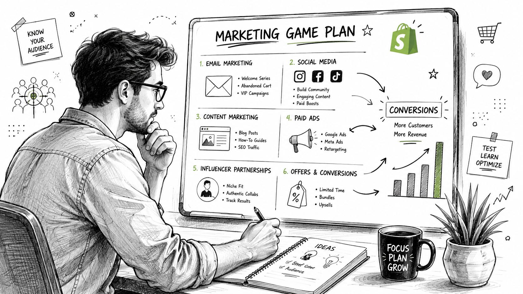
Smarter Contrast Tactics for Shopify Merchants
The stronger approach is to stop treating contrast as a pricing trick and start using it as a value design tool.
That means creating contrast around access, experience, and earned reward, not just around markdown size. You still influence perception. You just do it in a way that doesn’t force every campaign to end in lower margins.
Contrast access, not only price
Early access is a contrast mechanic.
The public sees a launch at one moment. SMS subscribers, loyalty members, or previous buyers see it earlier. The offer may be identical. The value feels different because access is different. On Shopify, that can show up through tagged customer segments, gated collection visibility, or app-based campaign states tied to customer identity.
This works especially well for brands that care about perception. You aren’t saying the product is cheaper. You’re saying the shopper’s relationship to the brand is different.
There’s also a deeper psychological reason exclusivity works. Research on egocentric contrast effects suggests that when self-esteem is threatened, people judge others more negatively to affirm their own self-worth. Related work helps explain why premium or exclusive positioning can be compelling, and one summary notes that 71% of consumers report higher engagement with brands offering status differentiation, as discussed in this PubMed-linked summary on egocentric contrast effects and brand exclusivity.
Contrast earned value against passive discounting
A generic code feels passive. An earned reward feels chosen.
That distinction matters. “Take 10% off” trains customers to expect a giveaway. “Achieve a better reward by engaging now” changes the mental frame. The shopper compares a standard outcome to a more rewarding one they can reach through action.
On Shopify, that could mean:
- Cart-based progression: A reward gets better when the customer reaches a threshold.
- Engagement-triggered offers: A customer reveals or earns a better incentive through participation.
- Tiered reward logic: Different actions create different benefits, rather than one blanket code for everyone.
The contrast here isn’t just numeric. It’s emotional. Passive discount versus earned gain. Commodity offer versus rewarding interaction.
Contrast the experience itself
Most storefront promotions are interchangeable. A banner. A popup. A code. Close, dismiss, move on.
That creates a different kind of contrast problem. Your promotion gets judged against every other forgettable promotion the shopper has seen that week.
A better move is to make the promotional experience feel distinct and on-brand. That’s where creative execution matters. If your team needs to produce ad creatives at scale for different product tiers, launch moments, or audience-specific promotional concepts, tools like ProdSnap can help keep those comparisons visually coherent across channels.
A promotion can create contrast before the customer even reads the price, through design, pacing, and perceived exclusivity.
For merchants, that means the offer architecture matters as much as the offer amount. A VIP drop, a gated reward, or a participation-based event gives customers something stronger to compare than “same discount, different week.” If you’re thinking through the pricing side of that system, Quikly’s guide to psychological pricing strategies is a strong next read.
Applying and Measuring Contrast in Your Promotions
Once you start using contrast more deliberately, the measurement has to mature too. If you only track top-line conversion, you’ll miss whether the promotion improved the business.
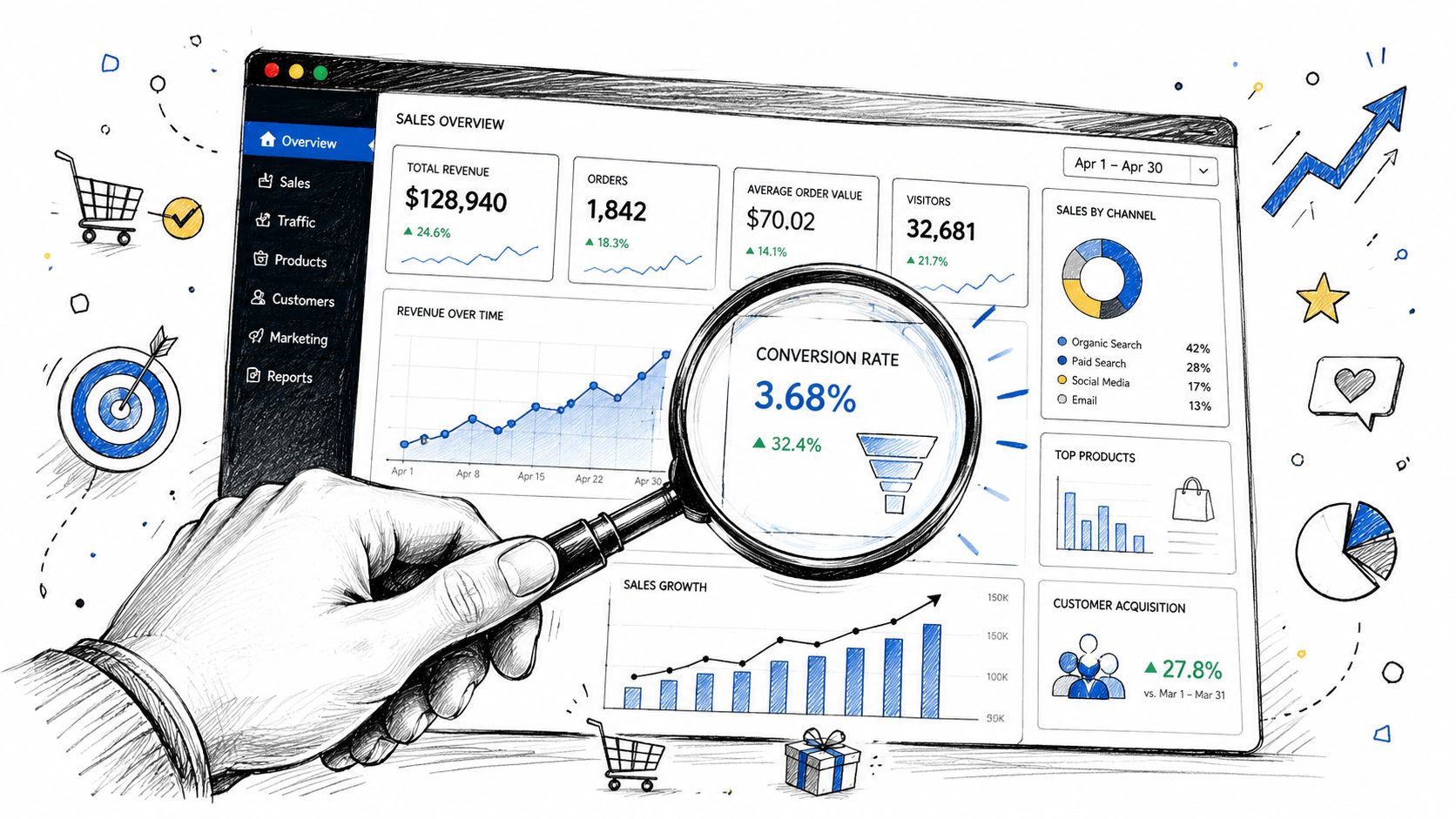
What to evaluate
Look at the promotion as a sequence, not a single event.
A useful review includes:
- Profit quality: Did the campaign generate orders without dragging margin lower than the result justified?
- Incremental behavior: Did customers act who otherwise would’ve stayed passive?
- Offer sensitivity: Did the next campaign have to work harder because this one set a stronger comparison point?
- Brand signal: Did the experience feel premium, routine, urgent, or cheap?
That last question matters more than many teams admit. Promotions don’t just create sales. They create expectations.
Watch for negative sequential contrast
One of the easiest mistakes is following a strong promotion with a weaker one and expecting normal performance. That isn’t how comparison works.
A study on sequential evaluation by Bhargava and Fisman found that after participants saw a highly attractive person, their willingness to date the next person dropped by nearly 2 percentage points. In ecommerce terms, a mediocre offer after a great one can underperform not because it’s objectively terrible, but because the customer’s reference point shifted.
Don’t judge a campaign in isolation if the customer experienced it in sequence.
This applies to email flows, SMS drops, onsite banners, retargeting ads, and launch calendars. If Monday’s offer was unusually strong, Wednesday’s “solid” offer may land like a disappointment.
Common mistakes Shopify teams make
- Using unbelievable anchors: If the premium option looks fake or irrelevant, the comparison collapses.
- Repeating the same contrast mechanic: Customers adapt quickly to predictable strike-throughs and countdown-led promos.
- Ignoring campaign order: Sequence changes interpretation.
- Optimizing only for conversion rate: A cheaper sale isn’t always a better sale.
If your team is producing lots of paid creative variations to test these sequences, the ShortGenius AI ad creative tool can help speed up iteration without turning every promotion into the same template.
The operational takeaway is simple. Contrast belongs in your testing plan, your merchandising logic, and your promotional calendar. It isn’t a one-off copy trick.
Moving Beyond Predictable Promotions
The contrast effect is neither good nor bad. It’s a lens customers already use.
The core decision for a Shopify brand is what you want customers comparing. If they’re always comparing today’s discount to your next discount, you’re in a race that usually ends with thinner margins and weaker brand cues. If they’re comparing ordinary shopping to a more rewarding, more exclusive, more intentional experience with your brand, you’re using the same psychology in a far healthier way.
That’s the sharper answer to what is the contrast effect for ecommerce teams. It’s not just a bias that makes one price look better next to another. It’s a principle that shapes how customers assign value in context.
Merchants who understand that don’t abandon promotions. They design them with more control. They decide what the shopper should compare, when that comparison should happen, and what kind of behavior it should reward. That’s how you protect conversion without treating margin and brand perception as collateral damage.
Quikly helps Shopify brands turn that kind of thinking into live promotional experiences. Instead of relying on predictable blanket discounts, teams use Quikly to create psychology-backed campaigns that motivate action, protect margin, and stay on-brand across the customer journey.
Topics: what is the contrast effect, behavioral psychology, pricing strategy, ecommerce marketing, shopify promotions