A discount is only useful if it changes timing. A predictable coupon tells shoppers they can buy whenever they like, which often means they wait for the next promotion. A tiered discount changes the decision by tying the reward to a spend threshold, quantity, product combination, time limit, or remaining allocation.
That distinction matters for Shopify brands facing weaker margins, insufficient conversion, and growing promotional fatigue. A descending offer might give the earliest shoppers the strongest reward, while a threshold-based offer increases savings as the basket grows. Neither structure is automatically better. The strongest promotion is the one that creates profitable incremental behavior without making the regular price look artificial.
The seven campaigns below are useful as strategic patterns. I’m looking at the offer structure, copy, placement, timing, visual treatment, and operational trade-offs, not just collecting attractive screenshots. The broader principle also applies beyond ecommerce promotions, as shown by this guide to boost creator motivation with tiers.
1. Quikly and the descending tiered drop
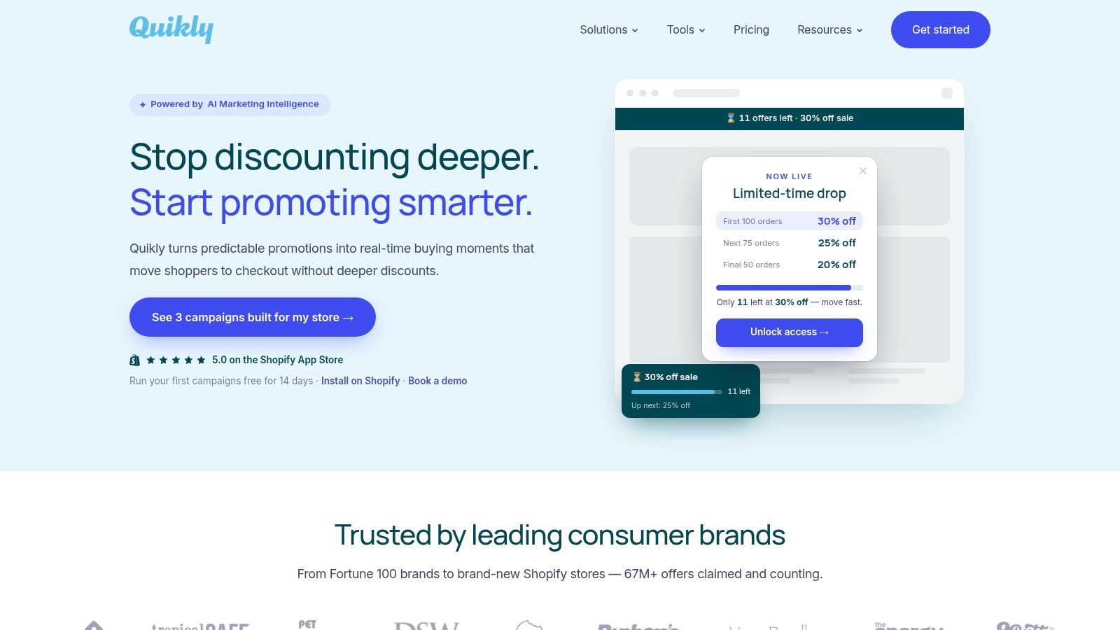
Quikly suits campaigns where the main constraint is action before the best reward disappears. Its Shopify-native campaigns can use one reward or a descending sequence, such as $10 off for the first 100 orders, $7 off for the next 75, and $5 off for the final 125 orders. The structure gives early shoppers a stronger reason to buy while keeping the promotion finite and easy to understand.
That design can protect margin better than a blanket coupon when many visitors already intend to purchase. Merchants set the quantity, timing, eligible products, exclusions, and fallback message, so the deepest reward does not remain available to every visitor throughout the campaign.
The behavioral logic has three parts. Limited availability makes the remaining allocation relevant. Loss aversion raises the perceived cost of missing the higher reward. Temporal discounting makes an immediate, credible benefit more appealing than an uncertain future promotion. UCLA Anderson’s summary of discount research found that participants shown sharply discounted Apple products waited an average of 52 seconds before abandoning an indefinitely loading survey, compared with more than 70 seconds among those shown regularly priced products. The same source reports that discount exposure increased impatience in an unrelated decision context. Urgency therefore needs a real constraint and a clear end state, rather than an aggressive timer used for decoration. UCLA Anderson’s analysis of discount-driven impatience provides useful context.
What to adapt
Use a headline that communicates the changing reward at a glance, such as “Claim the biggest reward while it’s available.” Show the current tier, next tier, and claims remaining only when those figures are accurate. Place the offer on the storefront, then repeat the same campaign logic through email, SMS, social, and other owned channels.
The presentation should match the store instead of looking like a generic overlay. This matters for premium products, where loud discount treatment can weaken perceived value more than the savings improve conversion. A small team can install the Shopify app in 2 minutes, and the platform offers a 14-day free trial, according to Quikly’s campaign platform.
Practical rule: Use the first tier to create urgency, not to give away the entire margin pool.
The operational trade-off is straightforward. Scarcity must be genuine, inventory and redemption rules require testing, and the fallback experience needs a clear message after a tier sells out. Public pricing isn’t detailed on the site, so merchants should use the trial or request implementation details before committing. For the mechanics and Shopify setup, see this guide to tiered discounts on Shopify.
2. ConvertFlow and the threshold ladder
ConvertFlow’s examples are useful when you need to understand how a spend threshold looks in practice. The executions associated with brands such as H&M and Eddie Bauer show the familiar ladder, where customers receive a larger reward as they move from one order value to the next. The value is less in the percentage itself and more in how the headline, threshold cards, fine print, and placement work together.
A spend-based structure is usually the clearest option for a broad Shopify catalog. It lets customers choose the products they want while giving them a reason to add one more item, upgrade a selection, or cross a shipping threshold. The danger is setting the first tier below the order value customers would have reached anyway. In that case, the campaign subsidizes existing demand.
The documented retail example of 5% off orders above $100, 10% off above $200, and 15% off above $300 increased average order value from $85 to $120, approximately a 41.2% increase, within six months. The source presents this as an illustrative retail case, not a controlled experiment, so treat it as a planning benchmark rather than an expected result. The tiered discount structure example is most useful for thinking about threshold placement.
How to adapt the pattern
Put the ladder where the shopper is making a decision, not only in a promotional landing page. A concise bar on the product page can introduce the offer, while the cart should show the remaining amount needed to reach the next tier. Recommend products that truly complement the order. Don’t push irrelevant add-ons just to cross a threshold.
ConvertFlow is particularly strong for creative inspiration and on-site placement. It’s less useful as a margin model, so calculate contribution profit separately, including payment, shipping, fulfillment, returns, and acquisition costs. For Shopify-specific implementation ideas, compare the campaign treatment with popups for Shopify, while keeping the promotion embedded in the shopping journey rather than relying on popup exposure alone.
3. ConvertCart and margin-gated structures
ConvertCart takes a more disciplined approach by comparing spend-based, quantity-based, and product-based tiers. That distinction matters because the same discount ladder can behave very differently depending on what customers buy. A spend threshold suits a mixed catalog, a quantity break fits repeatable products, and a product tier works better when the merchant wants to guide customers toward a defined bundle.
The practical strength here is the attention to guardrails. A tier should only exist if the incremental basket value can absorb the added discount and variable costs. A higher average order value can still produce less profit if shoppers move into a deeper tier without adding enough profitable merchandise.
One directional benchmark in the provided margin guidance estimates that a 15% discount requires roughly 27% more units for a business with a 70% gross margin, but about 75% more units for one with a 35% gross margin. These are planning benchmarks, not universal outcomes, and they show why a copied “10%, 15%, 20%” ladder is irresponsible without margin math. ConvertCart’s margin-focused tiered discount guide is useful for evaluating the structure before launch.
What works operationally
Start with two or three tiers and exclude products that can’t support the offer. Test gift cards, free shipping, or a useful product incentive where a direct percentage reduction would cut too far. Keep the reward jump meaningful enough to justify the next threshold, but don’t make the top tier so attractive that customers delay purchase.
ConvertCart is strong for seasonal planning, especially when order volume and fulfillment pressure make a careless BFCM ladder expensive. Its limitation is creative depth. You’ll get more strategic guardrails than polished interface references, so pair the planning work with an on-site prototype and a contribution-margin check.
4. SkaiLama and the presentation layer
SkaiLama treats presentation as a performance variable. The difference between a clear tier table and a confusing percentage list can matter more than an extra discount point. Percentage tiers, fixed-amount tiers, and product-based rewards all work in the right context, provided shoppers can understand the rule without decoding it. Place the offer in a tier table, cart callout, or product-page module where the qualifying action is visible.
Fixed amounts make savings feel concrete, especially across products with similar prices. Percentages scale better across a wide price range. Product tiers restrict the promotion to selected items, which can protect margin when only certain products can support the reward.
The multitier discount effect gives the intermediate tier a framing role. In a Journal of Marketing Research example, a regular price of $6.99 per item and a two-item price of $5.59 per item became more attractive after adding a one-item tier at $6.79. The study found that the extra tier increased perceived price difference, although the effect varied with the added tier’s price, prior purchase frequency, and distrust of the original price. The Journal of Marketing Research study on multitier discounts suggests the middle tier works best as a framing device rather than a fallback option.
Make the interface do less
Keep tier names short. Display the qualifying action beside the reward, and show the remaining gap when a shopper is close to the next threshold. Recommend a relevant item in the cart instead of sending the shopper back through the catalog.
SkaiLama’s companion Discount Gallery and visual references provide practical starting points for storefront UI. Their limitation is evidence: the examples offer little performance analysis or A/B test detail, and some need localization before a US Shopify store can use them. Borrow the layout, then test the wording, placement, timing, and margin impact in your market. A polished interface should clarify the offer, not disguise an unprofitable one.
5. Discounty and the incentive bundle
Discounty shows that tier rewards do not have to be percentage cuts. Brand-led campaigns associated with Francesca’s and Thrive Causemetics combine spend thresholds with free shipping or cause-related hooks. These structures can make the reward feel more purposeful while limiting the need for a deeper price reduction.
Free shipping works when fulfillment economics support it and the threshold exceeds the order value customers would otherwise place. Set the threshold high enough to protect contribution margin, then check whether the added orders cover packaging, carrier costs, and likely returns.
Cause-related tiers require a real partnership and a clear explanation of what the merchant funds. State the contribution, the qualifying action, and when the funding occurs. This gives the incentive credibility and protects the brand from appearing to attach charitable language to a standard discount.
Presentation changes how shoppers judge the saving. Research summarized in a Journal of Marketing Research paper found that comparing the discount with the sale price, rather than relying only on the original list price, can increase perceived discount depth and purchase intentions. Related research found that financially restricted consumers were less likely to use high-low pricing and short-period promotions than everyday-low pricing and promotions without a time limit. The research on price framing and promotion response supports transparent value comparisons.
A practical adaptation
Write each tier as a customer outcome. “Spend more, we’ll cover shipping” is easier to evaluate than a paragraph of conditions. For a cause-related offer, specify what the merchant funds and when, using plain language.
Discounty gives new marketers straightforward campaign references. Adapt the structure, message, placement, timing, and incentive to the store’s margins and brand standards. The examples do not resolve inventory exposure, contribution margin, returns, or incremental profit, so those checks still belong in the campaign plan.
6. BOGOS and quantity breaks
BOGOS works best when customers already have a practical reason to buy multiple units. Consumables, replenishment products, multipacks, and simple bundles make the value easy to understand. “Buy more, save more” should help customers stock up on useful products, not disguise an inconvenient assortment clearance.
The strongest setup connects the offer to Shopify’s product selector, cart, and discount rules. State the qualifying quantity, eligible variants, and reward before checkout. That reduces disputes, limits support requests, and makes the promotion easier to test. Teams responsible for chargeback prevention roles will also benefit from clear eligibility rules and checkout messaging.
A PNAS field experiment involving more than 14 million consumers of a virtual good found that quantity discounts ranging from 9% to 70% had remarkably little overall revenue impact. The main response came from existing buyers. Depending on the structure, progressively deeper discounts increased quantities purchased by 6.7%, 11.2%, and 44.9% relative to the standard discount treatment. Infrequent purchasers responded more strongly, while extreme discounts on large quantities could discourage shoppers considering smaller purchases. The PNAS quantity-discount field experiment supports testing the tier structure rather than assuming the deepest offer will create demand.
Protect the smaller order
Keep the single-unit option visible and credible. A shopper buying one expensive or unfamiliar product should not feel penalized. Present the quantity break as an upgrade for customers who already intend to purchase, then measure units per order, conversion, gross margin, and repeat behavior.
BOGOS offers a practical way to translate campaign ideas into Shopify rules, but the merchant must validate the economics. Check whether the discount applies to units customers would have purchased anyway, whether mixed variants behave correctly, and whether the offer creates stock or fulfillment pressure. The related Shopify BOGO strategy provides a useful behavioral framing, but margin and incremental profit still determine whether the campaign deserves wider placement.
7. Amazon Business and the three-card quantity format
Amazon Business provides a clear visual reference for communicating quantity discounts to B2B buyers. Its downloadable example uses three side-by-side tier cards, which makes the price break easy to scan. The format suits wholesale catalogs, professional buyers, and DTC product pages where customers already understand that larger quantities reduce the effective unit price.
The design principle is more important than the specific layout. Each card should show the qualifying quantity, the resulting price or savings, and any terms that affect eligibility. Buyers shouldn’t need to open a separate help page to understand whether the discount applies across variants, products, or only one SKU.
Adapt it for DTC
A wholesale-style card can feel too transactional for a consumer brand, so soften the language without hiding the economics. “Single,” “stock-up,” and “best value” can work for a consumable product, provided the customer can see the actual unit economics. For premium goods, use curated bundle names instead of making the page look like a price sheet.
The source is primarily a format reference rather than a performance guide, and it’s older than many current Shopify implementations. Use it to improve clarity on product pages and wholesale price lists, then connect the design to inventory, shipping, and repeat-purchase behavior. Don’t assume a B2B quantity structure will transfer directly to a DTC shopper who may only need one item.
Top 7 Tiered Discount Solutions
| Solution | Implementation complexity | Resource requirements | Expected outcomes | Ideal use cases | Key advantages |
|---|---|---|---|---|---|
| Quikly | Low, 2‑minute install; campaign setup required | Shopify store, small marketing team, optional enterprise support | Faster purchases, higher AOV, more email/SMS signups; measurable revenue lift | DTC Shopify merchants, Plus stores, agencies wanting conversion lift without deeper discounts | Shopify‑native, cross‑channel, data‑driven, proven case studies |
| ConvertFlow | Low–Medium, adapt examples to site/landing pages | Marketing time for creative/copy, designer to adapt screenshots | Improved AOV through persuasive on‑site messaging | Marketers seeking creative on‑site funnel examples for Shopify or landing pages | Real brand examples, actionable creative inspiration |
| ConvertCart | Medium, strategy and margin planning needed | Analytical input, campaign planning for seasonal events | Conversion lift balanced with margin protection | Seasonal/BFCM planning, margin‑sensitive promotions | Emphasis on profitability, practical guardrails and tier comparisons |
| SkaiLama | Low, example‑heavy for quick adaptation | Minimal; copy and design tweaks, localization as needed | Faster implementation of clear tier UIs and presentation improvements | Stores wanting UI and presentation guidance for tiered offers | Concrete UI examples, Discount Gallery, presentation best practices |
| Discounty | Very low, primer-level guidance | Minimal marketing time for idea adoption | Simple, brand-led campaign ideas; pairing tiers with shipping/causes | Marketers new to tiered discounts or seeking straightforward models | Clear definitions, recognizable brand examples, accessible writing |
| BOGOS (Shopify App) | Medium, app configuration mapped to cart logic | Shopify store, app install and configuration, QA to avoid pitfalls | Actionable quantity/spend tier implementations (consumables, bundles) | Merchants implementing quantity breaks, bundles, BOGO mechanics on Shopify | Direct mapping to Shopify cart logic, practical implementation notes |
| Amazon Business (Quantity Discounts) | Low, format/reference resource, not a tool | Design/formatting to mirror PDPs or wholesale lists | Clear communication of quantity breaks for B2B buyers | B2B sellers, wholesalers, pro‑customer catalogs and price lists | Visual tier cards, downloadable PDF, clear B2B presentation format |
Turn the Pattern Into a Controlled Promotion
These examples point to a practical selection framework. Choose spend tiers when the goal is basket growth across a broad catalog. Choose quantity tiers for consumables, replenishment products, and multipacks where customers have a credible reason to stock up. Choose product tiers when you want to guide shoppers toward bundles or protect selected products from an open-ended discount.
Use a time- or quantity-bound descending reward when immediate action matters more than basket expansion. The earliest shopper receives the strongest reward, later shoppers still have a reason to purchase, and the merchant controls how much discount inventory is exposed. This structure is especially useful when a flat promotion would train customers to wait or when a launch needs a defined purchase window.
The underlying evidence supports restraint. Research on retail promotions found that increasing discount depth could be more effective per dollar spent than increasing promotional frequency, and that increasing depth while reducing frequency could outperform increasing depth alone. A separate long-run study found that deeper current discounts increased future purchases among first-time customers but reduced future purchases among established customers. The retail promotion research on timing and discount depth reinforces the need to treat customer status and promotional frequency as part of the design.
Launch checklist
- Set a margin floor: Include product cost, fulfillment, shipping, payment fees, returns, acquisition cost, and the incremental discount in the calculation.
- Define exclusions: Remove low-margin SKUs, already-discounted products, oversized items, and products with constrained inventory where necessary.
- Make thresholds obvious: Show the qualifying spend, quantity, or product combination beside the reward. Don’t bury the rule in fine print.
- Place the offer at decision points: Use the product page, cart, checkout-adjacent messaging, email, and SMS according to the campaign’s timing.
- Use honest availability: If a reward is quantity-bound, make the claim limit real. If it expires, show the actual end time and provide clear fallback messaging.
- Measure profit, not only conversion: Track conversion rate, average order value, realized discount rate, units per order, signup rate, returns, and incremental profit.
- Review customer mix: Compare first-time and established customers. A promotion that acquires demand may have a different long-term effect from one aimed at existing buyers.
The best tiered discounts example isn’t the one with the most dramatic top tier. It’s the one whose mechanics create a better decision for both sides. The shopper gets a clear reason to act or add a useful item, while the merchant earns incremental revenue without surrendering unnecessary margin or weakening the regular price.
Quikly turns flat promotions into time- and quantity-bound experiences, including descending tiered drops that reward shoppers who act early. Visit Quikly to see how a Shopify campaign can increase urgency, basket value, and signups without defaulting to a deeper blanket discount.
Topics: tiered discounts example, tiered discounts, Shopify promotions, discount strategy, ecommerce examples