Choice architecture is the deliberate design of how choices are presented to influence decision-making, and across a large meta-analysis it produced a Cohen’s d of 0.43 with a 95% confidence interval of [0.38, 0.48] on behavior change. For a Shopify store, that means the way you structure options, defaults, and friction can change what customers buy without changing the products themselves or dropping your prices.
If you run a store, you’ve seen the same pattern enough times to recognize it instantly. Traffic lands. Product pages get viewed. Some shoppers add to cart. Then the purchase stalls until you send a discount, run a sitewide sale, or train customers yet again to wait for the next promotion.
That cycle feels normal because most ecommerce teams treat conversion as a pricing problem. A lot of the time, it’s a decision design problem. Customers aren’t only reacting to price. They’re reacting to how easy the store makes it to choose, compare, commit, and complete a purchase.
The Hidden Force Shaping Every Purchase Decision
A shopper lands on a product page for a premium hoodie. They like the product. They don’t hate the price. But the page asks them to pick between too many variants, compare several offer messages, decode shipping details, and decide whether now is the right time to buy. Nothing feels wrong in isolation. Together, it creates hesitation.
That hesitation is where margins disappear. A merchant sees indecision and answers it with a discount code. The customer learns the pattern. Browse now, buy later, wait for the offer. Brand value softens, promotions get louder, and full-price intent gets weaker.
Choice architecture is the discipline of designing those moments so the next best action feels clear, natural, and worth taking. In plain terms, it’s how you organize the context around a decision. Richard Thaler and Cass Sunstein defined it as influencing choice by “organizing the context in which people make decisions” in their overview of choice architecture.
Why this matters more than another discount
The strongest merchants don’t just ask, “How do we increase conversion?” They ask better questions:
- Which option feels standard
- What choice appears first
- Where does the customer experience unnecessary effort
- What makes a full-price purchase feel easy enough to complete
Practical rule: If your store only converts when you cut price, your offer strategy is probably compensating for weak decision design.
The important shift is this. Choice architecture isn’t only about nudging someone toward any purchase. For ecommerce, it’s also about protecting profit by guiding passive shoppers toward action without defaulting to mass discounting.
The Science Behind the Nudge
A shopper lands on a product page, sees six variants, two bundle options, a subscription toggle, and three shipping messages. Nothing is technically broken. Conversion still stalls because the customer has to do too much decision work before feeling confident enough to buy.
That is the core idea behind the nudge. Thaler and Sunstein gave the field its modern vocabulary in Nudge and tied it to libertarian paternalism: people keep their options, but the environment makes one path easier to choose. For a Shopify merchant, that matters because the job is rarely just to offer choice. The job is to arrange choice so the shopper can commit at full price without feeling pushed into a coupon hunt.

Every store already does this. Product grids rank items. PDPs give visual weight to certain claims. Checkout flows either keep attention on the purchase or send it wandering. Choice architecture is present whether the team designed it on purpose or inherited it from a theme, app stack, or a series of quick CRO tests.
What the research says about effectiveness
The case for choice architecture is stronger than generic conversion advice because it has been tested across many settings. A meta-analysis in PNAS found that choice architecture interventions produced a consistent small-to-medium effect size of d = 0.43, and analysts also found that changes to the decision structure outperformed interventions that only described options or tried to reinforce intentions in the PNAS analysis of choice architecture interventions.
The same analysis found a real constraint. Some interventions failed, and some likely backfired. That is a useful warning for ecommerce teams. A default, recommendation badge, or checkout prompt only works when it matches customer intent, category norms, and the amount of effort the purchase reasonably deserves.
This is also why reducing overload matters. If a category page, bundle builder, or PDP asks the shopper to compare too many similar options, friction rises before price even enters the conversation. Brands dealing with broad assortments should study the consumer psychology behind choice overload, because too much freedom often pushes people to delay the purchase rather than complete it.
Why merchants should care about design, not decoration
Good design supports decision-making when it clarifies hierarchy, lowers mental effort, and signals what to do next. A beautiful page can still underperform if the shopper has to decode which variant is standard, which bundle is best value, or why one option deserves the higher price.
That distinction matters for margin protection. Merchants often respond to hesitation with a promotion because discounting is visible and fast. Better decision design solves the earlier problem. It helps customers reach a purchase decision before they start looking for a reason to wait.
If you want a useful complementary read on how interface decisions affect customer behavior, this guide on how to win more customers with design adds practical perspective from the design side.
A better-looking page can still be a bad decision environment if it makes the customer work too hard to choose.
The 7 Core Principles of Choice Architecture
These principles show up everywhere in ecommerce, even when teams don’t name them that way. The point isn’t to memorize terminology. The point is to understand which levers change behavior and when to use them.
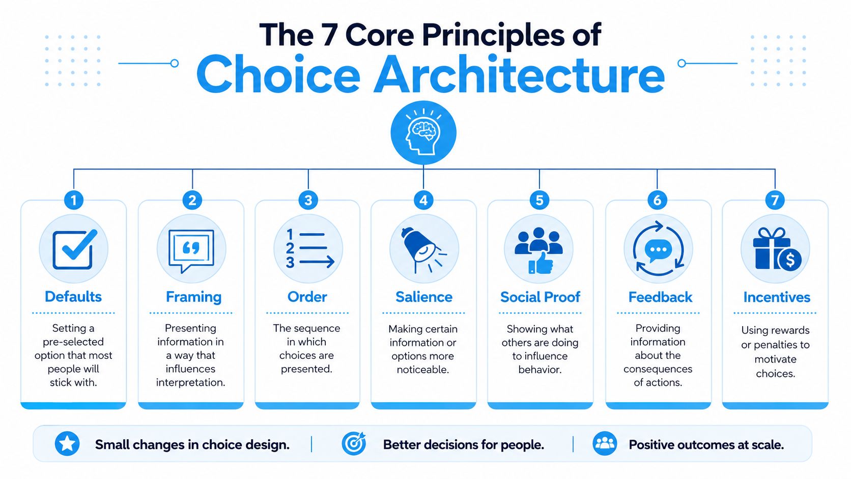
Defaults and framing
Defaults do more than save clicks. They communicate what’s normal, recommended, or standard. Research summaries note that the default option is the single most powerful lever because people often stick with pre-selected choices, as described in The Decision Lab’s choice architecture reference.
For a Shopify merchant, that could mean:
- Variant defaults: Showing the most universally appealing size or color first.
- Bundle defaults: Pre-selecting a standard bundle instead of forcing the shopper to build one from scratch.
- Delivery defaults: Presenting the most sensible shipping choice as the standard path.
Framing changes how the same option feels. A product can be framed as the most popular standard, the best-value set, or the easiest starter option. None of those change the SKU. They change the mental model around the SKU.
Order and salience
Order matters because people process what they see first with more attention than what comes later. On collection pages, that means your top rows don’t just display inventory. They set the commercial agenda.
Salience is about visual prominence. Not every piece of information deserves equal weight. A shopper should instantly notice the primary action, the key reassurance, and the one or two details that reduce uncertainty.
A simple comparison makes the point:
| Element | Weak implementation | Strong implementation |
|---|---|---|
| Primary CTA | Blends into page clutter | Visually distinct and contextually clear |
| Product comparison | Mixed attribute language across items | Same attributes presented consistently |
| Offer message | Competes with five other promos | One relevant message tied to the current decision |
Social proof and feedback
Social proof works when it reduces uncertainty for someone who’s close to acting. The same Decision Lab reference notes that messages like “80% of customers choose the standard option” can significantly shift behavior because people use popularity as a cue for safety and fit.
That’s useful on:
- Product pages, where “most popular” can simplify variant or bundle selection
- Pricing tables, where a standard plan needs a clear center of gravity
- Cart modules, where popular add-ons can feel more legitimate than random upsells
Feedback closes the loop between action and consequence. Progress bars, shipping threshold indicators, and confirmation states all help shoppers understand what their next action changes.
Operator’s lens: Good feedback doesn’t just reassure. It keeps the buyer oriented, which is critical once they’ve already started moving toward purchase.
Constraints and incentives
Constraints sound negative, but they often help. A store that limits options to the most relevant ones is usually easier to buy from than a store that dumps every possible permutation into one screen.
If you’ve seen shoppers freeze when browsing giant assortments, that’s not surprising. The key principles behind reducing overload, chunking options, and guiding choices over time are explored in Quikly’s piece on the consumer psychology behind choice overload.
Incentives matter too, but they’re often overused in the bluntest way possible. The weak version is an automatic discount for everyone. The smarter version is an incentive tied to behavior, commitment, or progression. That keeps the incentive from becoming the entire strategy.
Choice Architecture in Action on Ecommerce Sites
You can spot good and bad choice architecture on almost any storefront once you know what to look for.
Take a product page. One version shows twelve variant combinations, three competing promotional banners, a buried returns policy, and a muted Add to Cart button. Another version narrows the visible decision, highlights the primary action, and removes anything that doesn’t help the purchase move forward. Same product. Very different buying experience.
What good implementation looks like
A familiar example comes from outside ecommerce. Organizing healthy food at eye level in a cafeteria increased selection by 20 to 30%, which shows how presentation changes action without restricting choice, according to Sue Behavioural Design’s explanation of choice architecture. The ecommerce parallel is direct. Put the right decision cue where attention already goes.
On a Shopify site, that usually means:
- Product pages: Make the key variant, primary CTA, and confidence-building details obvious first.
- Pricing pages: Use visual hierarchy so the intended option reads as the standard choice, not just one option among many.
- Checkout flows: Remove any field, decision, or detour that doesn’t help the shopper finish.
The same source notes that removing a single form field or decision step can produce a measurable conversion uplift. That’s why efficient checkout work matters so much more than cosmetic tweaks.
What weak implementation usually looks like
Bad choice architecture often hides behind “giving customers more freedom.” In practice, it looks like this:
- Too many paths: The shopper has to decide where to look before they can decide what to buy.
- Mixed signals: The page says premium brand, discount-first promo bar, and urgency widget all at once.
- Unclear priorities: The store treats every message as important, so nothing stands out.
If you’re evaluating your store more broadly, this roundup of e-commerce growth strategies is useful because it places user journey decisions in a larger growth context rather than treating conversion as a standalone page problem.
If customers hesitate at the same moment repeatedly, don’t assume they need a better price. First ask whether the interface is making the decision heavier than it needs to be.
How to Implement Choice Architecture on Shopify
Most Shopify teams don’t need a complete rebuild. They need a disciplined audit of where shoppers get stuck, what the store is implicitly recommending, and where complexity is leaking into the path to purchase.
Start with the decisions, not the pages
Map the major customer decisions in sequence:
- Entry decision: Did the shopper land on the right collection, PDP, or campaign page?
- Selection decision: Can they choose the right product or variant quickly?
- Commitment decision: Does the store make adding to cart feel safe and straightforward?
- Completion decision: Is checkout focused enough to finish cleanly?
That sequence matters because choice architecture works best when you identify the exact behavior you want at each step.
Reduce overload before you add persuasion
One of the clearest practical rules comes from the overload research. When alternatives exceed a cognitive threshold, often 7+ options, decision paralysis can push drop-off above 40%. Reducing or categorizing options and using progressive disclosure can increase completion rates by 15 to 25%.
For Shopify, that usually means:
- Collection curation: Don’t surface every SKU equally. Build tighter collections around use case, need state, or shopper intent.
- Chunked comparisons: If you sell technical products, standardize comparison attributes across cards and PDPs.
- Progressive disclosure: Ask for broad choices first, then reveal details. That’s especially useful for bundles, subscriptions, and configurable products.
Use Shopify-native levers intelligently
Shopify gives merchants more control than many teams use. You can apply choice architecture through:
- Theme hierarchy: Reorder modules so the decision-supporting information appears before secondary content.
- Variant presentation: Default to the most broadly suitable option when it helps the buyer.
- Cart logic: Structure add-ons and thresholds so they clarify value instead of interrupting intent.
- Checkout refinement: Audit every field and every optional branch. Quikly’s guide to Shopify checkout optimization is a useful reference if you want to tighten that final step.
A practical note for content teams: if you’re building PDP explainers, launch assets, or promotional walkthroughs, tools that speed up visual communication can help. A lightweight transform text to video app can make it easier to turn offer explanations into clear assets without adding production drag.
Treat promotions as decision design
Many stores miss the point by treating promotions as price events instead of behavioral systems.
A stronger approach is to design promotions that:
- Reward engagement: The customer does something to access value.
- Control exposure: Not every visitor gets the same incentive at the same time.
- Preserve the brand: The offer feels intentional, not desperate.
- Guide a path: The promotion supports a buying decision rather than replacing it.
That’s what turns choice architecture from an academic concept into a commercial operating model.
Protecting Margins with Productive Friction
The default ecommerce advice says friction is always bad. That’s too simplistic. Some friction kills purchases. Some friction improves them.
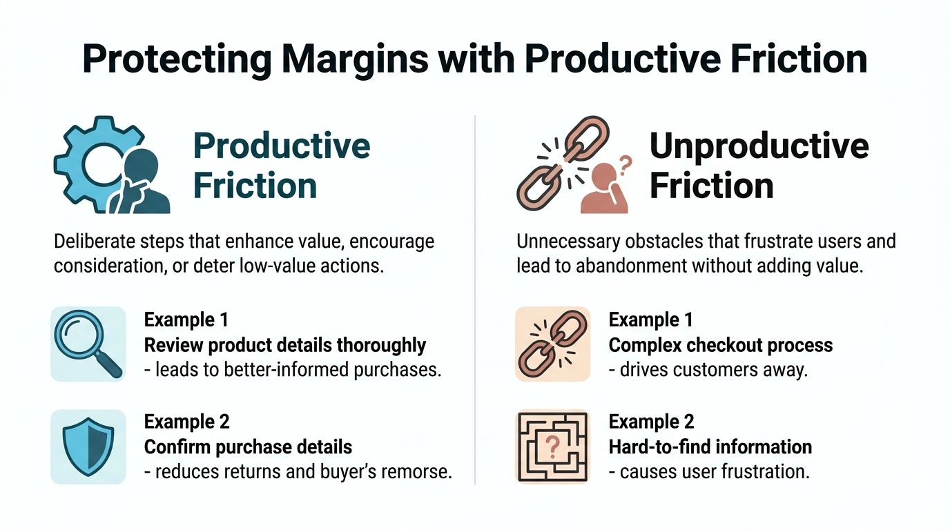
Not all friction does the same job
Unproductive friction is the obvious enemy. Hidden shipping details, confusing bundle builders, cluttered carts, and too many decisions at once create abandonment without adding value.
Productive friction does something different. It adds a small, meaningful step that increases attention, commitment, or perceived value. That could be a gamified achievement, a tiered reward path, or a structured offer that makes the customer earn access rather than receive an automatic markdown.
Many brands are selling into a customer base that has learned to delay buying. Verified market data cited in the brief shows 68% of consumers now delay purchases waiting for promotions. In that environment, the strategic value of choice architecture isn’t just higher conversion. It’s helping shoppers act now without turning every visit into a race to the lowest price.
Where brands get this wrong
The mistake is assuming every obstacle should be removed. If you remove all friction and the only remaining motivator is price, you’ve built a fast path to margin erosion.
A better test is whether the friction improves the purchase:
- Does it increase clarity
- Does it increase investment
- Does it make the offer feel earned
- Does it protect full-price positioning
If the answer is yes, it may be worth keeping. Quikly’s article on psychological pricing strategies is a good companion read because pricing architecture and choice architecture often work together.
The strongest promotional systems don’t eliminate effort indiscriminately. They remove wasted effort and keep the moments that build commitment.
The Ethics of Influence and Measuring Impact
Choice architecture has an ethical line, and merchants should be clear about it. A helpful nudge makes the better path easier to see and easier to take. A dark pattern hides alternatives, obscures consequences, or creates pressure the shopper can’t reasonably evaluate.
The distinction gets sharper in consent flows. Research from the FTC paper on data sharing and interface design found that deliberate obstruction was far more potent than simple visual changes like reordering or color emphasis, which had minimal effects, according to the FTC research on consent interface design. That’s a useful warning for ecommerce teams. If your architecture depends on making the undesired choice hard to find, you’re in dangerous territory.
A simple ethics check
Ask four questions before launching a test:
- Is the preferred option reasonable for the customer
- Can the shopper still choose differently without hassle
- Are the consequences of the choice clear
- Would you be comfortable explaining the design choice publicly
Then measure impact like an operator, not just a CRO dashboard watcher. Track conversion, yes. But also watch average order value, gross margin, discount reliance, and return quality. A change that lifts orders while weakening margin or training promo dependency isn’t a good decision architecture. It’s a short-term patch.
Good choice architecture creates a cleaner purchase path for the customer and a healthier commercial model for the brand. That’s the standard worth aiming for.
Quikly helps Shopify brands apply these principles where they matter most, inside promotions that increase purchase conversions without forcing margin tradeoffs or weakening brand perception. If you want a more durable alternative to blanket discounting, see how Quikly turns behavioral science into fully on-brand promotional experiences.
Topics: choice architecture, behavioral economics, ecommerce conversion, shopify promotions, nudge theory