Most advice on ecommerce performance metrics starts in the wrong place. It treats conversion rate as the headline number, then works backward from there. That sounds sensible until you realize a store can raise conversion with blunt discounts, only to come out weaker on margin, customer quality, and repeat purchase behavior.
That’s the trap many Shopify brands are in now. They’re buying expensive traffic, pushing harder offers, and celebrating short-term sales lifts that don’t hold up once you look at contribution margin or customer value over time. A dashboard can say “up and to the right” while the business underneath gets harder to scale.
A better approach is to read ecommerce performance metrics as a system, not a scoreboard. Traffic quality affects conversion. Promotional mechanics affect AOV. Acquisition tactics shape LTV. And if the only lever you trust is “discount more,” you usually improve one number by damaging three others.
Why Chasing Higher Conversions Can Shrink Your Profits
Conversion rate is the easiest ecommerce win to fake.
Teams see the number rise and assume the business got healthier. Sometimes it did. Sometimes the store just paid for the lift with margin, weaker customer quality, and a shopper base that now waits for the next promo.
Older benchmark studies from firms like Monetate helped cement conversion rate as the headline KPI, especially once merchants could compare desktop and mobile performance side by side. Benchmarks have value. They become dangerous when they turn into a target divorced from merchandising, traffic mix, and gross profit. A brand running paid social at rising CPMs can post a better site conversion rate and still make the economics worse. Teams working on media efficiency should read conversion alongside traffic cost, not apart from it. Koast’s guide to achieving optimal ROAS and ROI is useful for that broader view.
A common Shopify mistake shows up in the conversion rate report after a sitewide discount. Orders jump. The dashboard looks better. Then the finance view catches what the headline metric missed: average selling price fell, contribution margin narrowed, and a chunk of those “new customers” only converted because the offer was unusually aggressive.
Practical rule: Treat conversion rate as a response metric, not a success metric on its own.
That rule changes how decisions get made. If conversion rises after free shipping, a bundle, or a discount, ask what else moved with it.
- Did AOV hold up or fall?
- Did first-order margin stay acceptable?
- Did the offer bring in buyers who are likely to purchase again?
- Did paid traffic become more efficient, or did the promotion just mask weak traffic quality?
That is why a store can benefit from studying ecommerce conversion rate benchmarks by channel and device without treating them as the finish line. The point is not to squeeze every possible transaction out of the session. The point is to build a commercial system where traffic converts at a healthy rate, orders remain profitable, and promotions do not train customers to buy only on markdown.
The Four Foundational Ecommerce Metrics
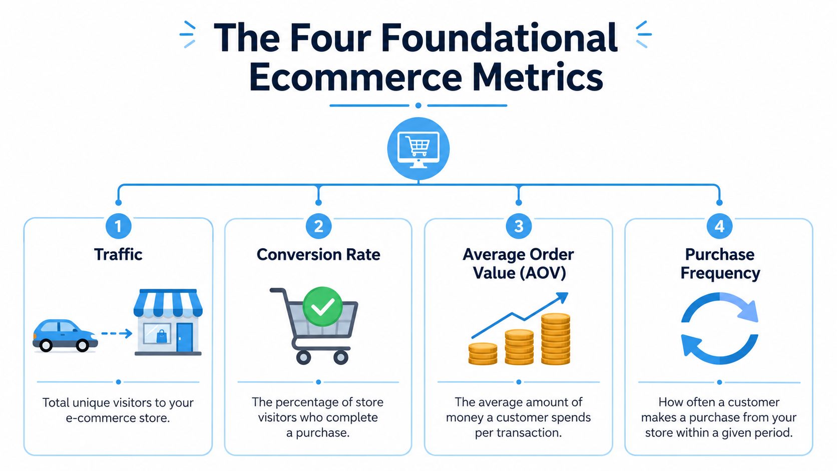
If a Shopify store doesn’t have clean visibility into the basics, the rest of the reporting stack gets noisy fast. Start with four numbers that tell you whether the store is attracting visitors, converting them, increasing basket size, and generating revenue from those interactions.
Traffic and what it actually tells you
Traffic is your session volume. In Shopify Analytics, this usually lives inside the main overview and reports tied to sessions over time, sessions by referrer, and sessions by device. On its own, traffic only tells you that people arrived.
What matters is the mix behind it. Paid social traffic behaves differently from branded search. Email traffic behaves differently from first-touch prospecting. If you’re spending heavily on Meta or Google, traffic should always be read alongside acquisition efficiency. A useful companion read for teams tightening media measurement is Koast’s guide to achieving optimal ROAS and ROI.
Conversion rate and where to find it
Conversion rate is typically calculated as transactions divided by sessions. Shopify surfaces this in native analytics, and most merchants also validate it in Google Analytics for channel and device segmentation.
If you want a deeper breakdown of what causes this number to move, it helps to review a dedicated guide on Shopify conversion rate fundamentals. The key point is simple. Conversion rate is useful, but it becomes misleading when it’s detached from traffic quality, product mix, and incentive strategy.
AOV and why operators care about it
Average order value, or AOV, is calculated as total revenue divided by total number of orders, and several ecommerce analyses identify it as one of the most direct ways to increase revenue without proportionally increasing acquisition spend, as explained in Anchanto’s ecommerce performance metrics guide.
That matters because AOV improvements often come from better merchandising, bundles, thresholds, or offer structure instead of more traffic. In operational terms, it’s one of the few levers that can improve profitability without putting immediate pressure on media budgets.
Raise AOV with smarter basket construction and you improve the economics of the same traffic you already paid for.
Revenue and the mistake merchants make with it
Revenue is the output metric. It’s often the first metric examined in Shopify dashboards, daily reports, and campaign recaps. It matters, but it’s the most dangerous number to read in isolation because it can rise while the business quality falls.
Here’s the practical way to use the big four together:
- Traffic tells you whether enough shoppers are reaching the store.
- Conversion rate tells you whether visits become orders.
- AOV tells you whether each order is economically strong.
- Revenue tells you what those interactions produced at the top line.
Foundational metrics are still foundational. They’re just not enough.
Moving Beyond the Transaction With CAC and LTV
A store can have decent traffic, acceptable conversion, and solid top-line revenue while still being hard to scale. The reason usually shows up when you move from order metrics to customer economics.
CAC shows what growth costs
Customer acquisition cost, or CAC, is the cost to acquire a new customer. In a simple operating model, merchants calculate it by dividing marketing spend by new customers acquired over the same period. On Shopify, that usually means combining store data with ad platform spend and attribution reports.
A lot of discount-driven growth stories start to wobble. The widespread use of CAC and CLV in the early 2020s exposed how fragile many ecommerce models were. By 2023 to 2025, major benchmarks for successful brands in North America and Europe highlighted a preferred CLV:CAC ratio of 3:1 or higher, with repeat-customer rates above 30%, according to NetSuite’s ecommerce metrics resource.
If a brand needs constant markdowns to convert paid traffic, CAC may look manageable for a moment, but the recovery math gets worse fast when those customers don’t come back at healthy margins.
LTV tells you whether the customer was worth buying
Lifetime value, often written as LTV or CLV, is a projection of how much value a customer generates over the relationship. A practical version uses order value, purchase frequency, and expected retention period. For operators who want a clearer strategic framing, AdStellar AI has a helpful explainer on understanding customer value.
The point isn’t to build a perfect finance model on day one. The point is to stop evaluating acquisition based only on first-order performance.
For Shopify teams trying to pressure-test their customer economics, a simple customer acquisition cost calculator can be a good starting point before moving into more segmented reporting.
The ratio matters more than either number alone
A healthy store doesn’t just acquire customers cheaply. It acquires customers who stay valuable long enough to justify the spend.
Consider the relationship this way:
| Metric | What it answers | What can go wrong |
|---|---|---|
| CAC | What did it cost to get the customer? | Paid channels get more expensive, or promotions become necessary to close the sale |
| LTV | What is that customer worth over time? | Low-intent buyers churn, buy only on sale, or never return |
| LTV:CAC | Is growth economically sustainable? | Revenue rises while payback gets weaker |
If your reporting stops at the first order, you can mistake unprofitable demand for product-market strength.
This is why transaction metrics need a second layer. They tell you what happened. CAC and LTV tell you whether it was worth it.
Using Diagnostic Metrics to Find Funnel Leaks
A weak funnel often gets misdiagnosed as an offer problem. That is how stores end up buying conversion with discounts instead of fixing the friction that caused the drop in the first place.
The faster way to diagnose the issue is to look at two points in sequence. Add-to-cart rate shows whether the product page is creating intent. Cart abandonment shows whether that intent survives checkout.
Baymard’s ongoing cart abandonment research puts average documented abandonment at a high level across ecommerce, which is why checkout diagnostics deserve more attention than they usually get in weekly reporting. Broad benchmark studies on commerce funnels also use add-to-cart rate as an early indicator of merchandising and product page health, not just sales performance. The benchmarks matter less than the gap between your own segments. Barrel’s guide to tracking ecommerce performance is useful here because it connects funnel metrics to practical causes such as page speed, device experience, and checkout friction.
Segment before you diagnose
Averages hide the leak.
Start with these cuts:
- Device to catch mobile-specific friction such as slow image loading, sticky banners covering CTA buttons, or long forms
- New vs. returning visitors to separate trust and education problems from checkout problems
- Traffic source to judge paid prospecting, email, affiliates, and branded search on their actual intent level
- Product category to avoid comparing low-consideration add-ons with higher-consideration hero products
One example. If mobile add-to-cart rate is 5% and desktop is 12%, check mobile PDP load speed, image weight, CTA placement, and variant selection first. Do not respond by increasing the discount. If the page is hard to use, a better offer may lift conversion while margin gets worse and the underlying leak stays in place.
Match the fix to the metric
Different leaks need different fixes.
If add-to-cart is soft, inspect product page clarity, review density, price framing, shipping visibility, and whether the first screen gives shoppers a reason to continue. If carts are filling but dying in checkout, look for surprise shipping costs, coupon-field distraction, forced account creation, payment method gaps, and mobile form burden.
This is the part many teams skip. They see conversion dip, launch a promotion, and call the problem solved when orders rise for a week. In practice, that move can hide a broken funnel, train customers to wait for incentives, and push profit down even when top-line revenue looks better.
Diagnostic metrics help you protect margin by fixing the actual constraint. That is a better operating habit than using discounts as a universal answer.
How Cohort Analysis Reveals Your True Growth Trajectory
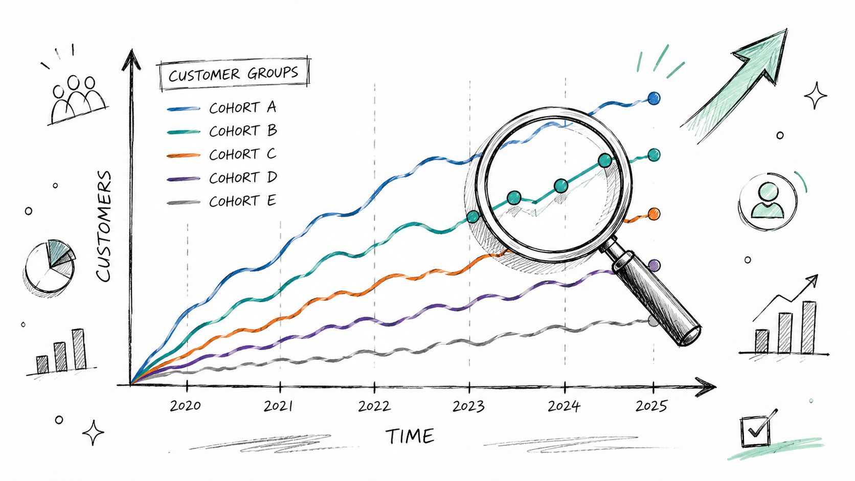
Month-over-month revenue hides a lot. Cohort analysis exposes it.
A cohort is a group of customers who share a starting point, usually the month of first purchase or the acquisition campaign that brought them in. Instead of asking, “Did sales go up?” cohort analysis asks, “What kind of customers did we just buy?”
Two cohorts can look equal on day one and nothing alike later
Take one cohort acquired through a steep sitewide discount. They may convert quickly because the decision is easy. The order looks good in the daily report, and the campaign may even make new customer acquisition look efficient.
Now compare that with a cohort acquired through a more selective promotional mechanic tied to behavior, product discovery, or basket-building. The initial conversion might look less dramatic at a glance, but the downstream quality can be stronger.
According to Cometly’s overview of ecommerce performance metrics, healthy DTC and retail brands maintain a CLV:CAC ratio above 3:1, and studies aggregating Shopify client data indicate that segmented, mechanics-driven promotions can increase AOV by 10% to 20% and boost repurchase rate by 5% to 15% without meaningfully increasing spend per acquisition.
That’s the difference cohort analysis surfaces. Not all acquired customers have the same long-term value, even when first-order revenue looks similar.
What to look for inside cohort reporting
In Shopify and connected analytics tools, cohort analysis becomes useful when you compare customer groups across:
- Repeat purchase behavior after the first order
- Order value trends over subsequent purchases
- Promotional dependency based on whether customers return only when discounted
- Payback quality based on whether early acquisition economics improve or degrade over time
A simple narrative usually emerges. Customers acquired through broad discounts often behave like bargain hunters. Customers acquired through more intentional mechanics often show stronger basket quality and healthier return behavior.
Cohorts turn promotion strategy into something measurable
It’s generally understood that “good revenue” and “bad revenue” exist. Cohort analysis is how you prove it.
The campaign that wins the week isn’t always the campaign that builds the business.
Once you start reading performance through cohorts, growth stops being a volume question. It becomes a customer-quality question. That shift changes how you evaluate offers, channels, and whether a promotion is helping the brand or subtly weakening it.
The Hidden Damage of Discount-Driven Promotions
Discounting works. That’s why brands keep using it. The problem is that it often works in the narrowest possible way.
A broad coupon can raise conversion, clear inventory, and create a quick revenue spike. But standard reporting often stops there. It doesn’t force the team to look at what happened to margin, what kind of customer was acquired, or whether the store just taught more shoppers to delay purchase until the next markdown.
The dashboard usually flatters the discount
Most ecommerce content still treats metrics as diagnostic and stops short of real-time margin modeling. That leaves Shopify merchants with a practical problem. They can track the right KPIs, but they still struggle to compare promotional strategies that might lift conversion while hurting margin or brand perception, a gap described in Splitbase’s discussion of ecommerce performance metrics.
That’s why discount-driven promotions keep winning internal debates. They move visible numbers fast.
If your team needs a deeper look at the operational downside of always reaching for coupons, this guide to Shopify discounts and their trade-offs is worth reviewing.
What discounting changes beyond conversion
The hidden damage usually shows up in four places:
- Margin compression because every order carries the promotional cost, including orders that may have converted anyway.
- Customer conditioning because shoppers learn your cadence and wait.
- AOV erosion when discounts reduce the incentive to build the basket thoughtfully.
- Brand softness when the offer becomes more memorable than the product.
Behavioral psychology is a key consideration. Blanket discounts rely on price alone. They don’t use scarcity bias, loss aversion, commitment and consistency, or earned reward structures in a deliberate way. They just reduce resistance by giving money away.
If every visitor gets the same incentive automatically, you’re not shaping behavior. You’re lowering the floor price of your brand.
Better reporting asks a harder question
Instead of asking “Did the promotion convert?” ask “What did it improve, what did it weaken, and would we want more customers acquired this way?”
That’s a tougher standard. It’s also the one that protects the business.
Measuring Performance with Behavior-Driven Promotions
The strongest promotional strategies don’t ignore conversion. They change how conversion happens.
Behavior-driven promotions use principles like scarcity bias, loss aversion, temporal discounting, and commitment and consistency to create momentum without defaulting to sitewide markdowns. The important difference is mechanical. The shopper engages, accesses, earns, or responds to a controlled experience rather than passively receiving the same discount everyone else gets.
What to measure when the promotion is an experience
If you run a behavior-driven campaign, standard metrics still matter. You still watch conversion, AOV, revenue, and repeat purchase behavior. But you also need a layer that ties the promotion to customer behavior.
Useful measures include:
- Promo engagement rate to see how many exposed shoppers actively interacted with the mechanic
- Conversion rate of engaged versus non-engaged visitors to separate promotional impact from background demand
- AOV change by exposure group to see whether the mechanic improved basket quality
- Repeat purchase behavior by campaign cohort to understand whether the promotion attracted durable customers
- Email and SMS follow-through when the promotion is supported by lifecycle messaging
For teams tightening the retention side of this work, Mailadept’s overview of Metrics to Track in Email Automation is a useful companion because promotional performance rarely lives on-site alone.
Why this model tends to age better
Behavior-driven promotions create controlled exposure instead of training the whole market to expect a lower price. They can reward action without making every order cheaper. They also give operators something more useful to optimize than “discount depth.”
Many Shopify teams don’t need more promotions. They need better promotional design.
A stronger framework looks like this:
| Question | Weak promotional read | Strong promotional read |
|---|---|---|
| Did more people buy? | Check sitewide conversion | Compare exposed, engaged, and non-engaged groups |
| Was the order healthy? | Check topline revenue | Check AOV and margin impact by campaign segment |
| Did we attract good customers? | Count first orders | Review repeat behavior by cohort |
| Did the brand get stronger? | Hard to tell | Look for reduced discount dependency and better engagement quality |
Good ecommerce performance metrics don’t just tell you whether a campaign was loud enough. They tell you whether it improved the economics of demand.
If your store is still measuring promotions mainly by short-term conversion, you’re missing the part that determines whether growth is durable. Quikly helps Shopify brands move beyond blanket discounting with psychology-backed promotional experiences designed to increase purchase conversion while protecting margin and brand perception.
Topics: Conversion Rate Optimization, ecommerce performance metrics