Traffic is up. Your paid social team is spending. Klaviyo flows are firing. Shopify sessions look healthy enough. Then you open the dashboard and see the same problem again. Plenty of visitors, not enough buyers, and the fastest fix on the table is another coupon.
That shortcut gets expensive fast. Each sale trains customers to wait for the next markdown, chips away at margin, and makes your full price feel optional. If you’re trying to figure out how to increase Shopify conversion rate without discounts, the answer usually isn’t one dramatic trick. It’s a set of sharper decisions that remove friction, build trust, and create reasons to act now that don’t cheapen the brand.
The good news is that most conversion problems aren’t solved by lowering price. They’re solved by making the decision easier, safer, and more immediate for the right shopper at the right moment.
The Vicious Cycle of Discount-Driven Growth
A lot of Shopify brands get stuck in the same loop. Conversion softens, acquisition costs feel heavier, and someone suggests a sale. It works just enough to become the default response. Then it takes more discounting to get the same lift, and the brand starts teaching customers that patience beats intent.
That isn’t just a conversion problem. It’s a margin problem and a perception problem. You don’t need many rounds of blanket promotions before shoppers start assuming the regular price is the sale price. Once that happens, every campaign has to work harder.
The deeper issue is that discounts often mask underlying issues. Slow mobile pages, weak product pages, hidden checkout friction, and thin social proof all get covered up by price cuts instead of fixed. That trade-off gets worse over time, especially for brands that want premium positioning or healthier repeat purchase behavior.
If that pattern sounds familiar, it’s worth reading Quikly’s take on the brand consequences of heavy discounting. The core point is simple. Conversion gained through constant markdowns is rarely as profitable or durable as it looks in the moment.
The better path is more operational than flashy. Diagnose where shoppers hesitate, tighten the product page, make trust visible, and use urgency in a way that feels real instead of manufactured.
Find the Leaks Before You Fix Them
Most stores don’t have a conversion problem everywhere. They have a conversion problem somewhere. If you start changing copy, colors, or apps without knowing where shoppers are dropping, you end up busy instead of effective.
Start with Shopify’s own funnel data. You want to know where the break is happening.
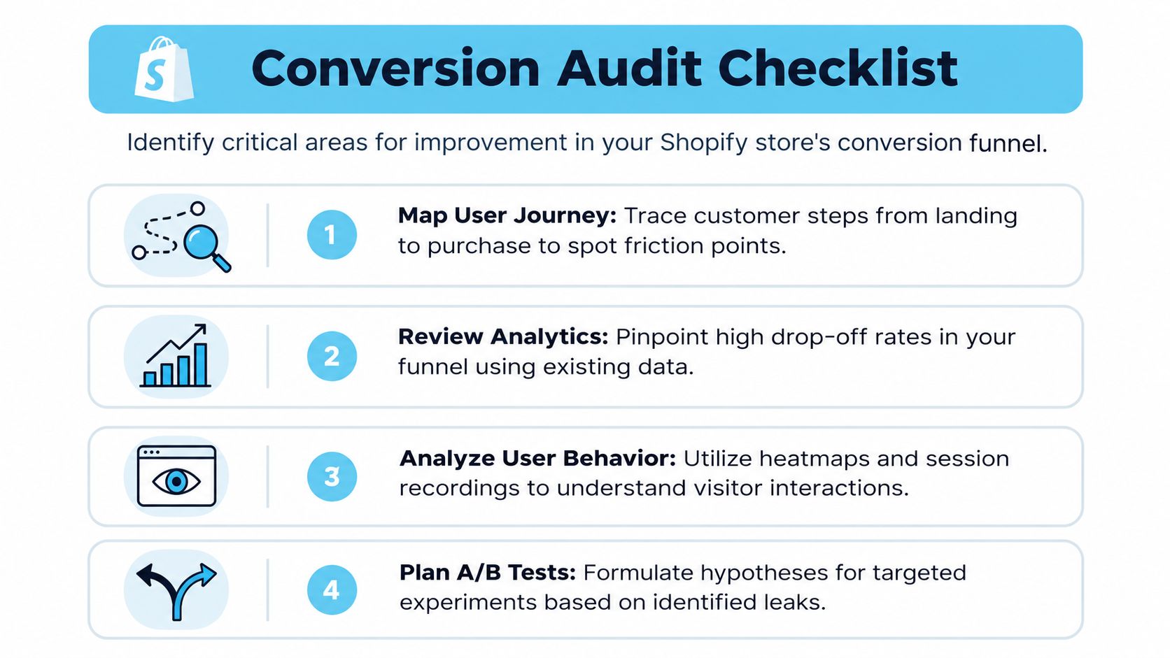
Start with the funnel, not opinions
Open Shopify Analytics and look at the path from product view to add to cart to checkout to purchase. Then ask four blunt questions:
- High product views, low add to cart: Is the product page unclear, weak on trust, or confusing on mobile?
- Healthy add to cart, low checkout starts: Is the cart drawer distracting, or are shipping expectations vague?
- Checkout starts, poor completion: Are costs showing up too late, or is the payment experience clunky?
- Sudden drop across the board: Did an app, theme update, or tracking issue break something?
This sounds basic, but it saves a lot of wasted effort. The first job is prioritization.
Watch real sessions
Numbers tell you where the leak is. Session recordings and heatmaps show why. Tools like Hotjar can reveal patterns that standard reports won’t surface cleanly, such as rage clicks, dead taps on mobile, or shoppers repeatedly scrolling for shipping details that should’ve been visible earlier.
Practical rule: If multiple users hesitate in the same spot, don’t blame traffic quality first. Fix the page.
Look especially at mobile behavior. A one-second delay in mobile page load time can reduce Shopify conversion rates by 7%, and over 70% of Shopify traffic originates from mobile devices, which makes speed one of the most important non-discount levers you can work on (Popupsmart on Shopify conversion statistics).
Run a simple audit in this order
Don’t audit everything equally. Audit in the order below.
- Mobile speed first. Test your homepage, collection pages, and top PDPs on your phone, not just a desktop preview. Slow image loads and jumpy layouts kill intent fast.
- Top product pages second. Look at your best traffic pages, not random SKUs. That’s where friction costs the most.
- Cart and checkout third. Check for surprise fees, awkward coupon box behavior, forced account creation, or payment confusion.
- App clutter last. Many Shopify stores carry old scripts from apps they barely use. That hurts speed and often creates UI conflicts.
If your team is planning a larger rebuild, it’s useful to study how developers develop Next.js e-commerce websites because many of the speed and architecture lessons apply even if you’re staying on Shopify. Cleaner front-end decisions usually lead to cleaner conversion paths.
For a more structured review process, Quikly’s guide to site conversion optimization is also worth bookmarking.
What your audit should produce
By the end, you should have a short list, not a brainstorm doc.
| Priority | What you found | What to test first |
|---|---|---|
| Mobile performance | Slow PDP load or heavy media | Compress images, remove scripts, simplify templates |
| Product page friction | Weak value prop or hidden details | Rewrite above-the-fold content, improve CTA placement |
| Trust gap | Thin or generic proof | Add product-specific reviews and visible reassurance |
| Checkout friction | Surprise costs or poor payment clarity | Show costs earlier, simplify options |
That list is your real CRO roadmap. Everything else is secondary.
Optimize Product Pages for Confidence Not Price
If a shopper lands on a product page and still feels unsure, no discount code is fixing the root issue. Product pages need to answer three questions quickly. What is this, why is it worth it, and can I trust the outcome?
Most Shopify PDPs underperform because they read like inventory records. They list materials, dimensions, and variants, but they don’t reduce uncertainty.
Fix the above-the-fold decision zone
The first screen has one job. It should help a shopper decide whether to keep evaluating the product.
That means tightening the essentials:
- Lead with a clear value proposition. Not a vague headline. A sharp line that tells the buyer what problem this solves or what result it creates.
- Use media that removes doubt. Include zoomable product images, in-use photos, and short product video where relevant.
- Make shipping and returns easy to find. Don’t bury basic reassurance in a tab or footer link.
- Keep the primary CTA unmistakable. It should stand out without shouting.
Mobile matters most here. Optimizing the Add to Cart button for mobile-first tactile interaction with a minimum 48px height, strong contrast, and active verbs like “Buy Now” or “Add to Bag” lifts mobile conversion by 18–24% globally, with up to 31% gains in US and EU markets (Yotpo on Shopify conversion tactics).
Write to remove hesitation
Feature lists rarely close the sale on their own. Benefits do. The copy should explain what changes for the buyer after purchase.
A weak version says the fabric is moisture-wicking. A stronger version says it stays comfortable through a long commute or a hot workout. Same product fact, different level of persuasion.
Buyers don’t need more adjectives. They need fewer unanswered questions.
A strong PDP usually covers the objections customers would otherwise send to support:
- Fit and sizing
- Material feel or durability
- How it works in real use
- Shipping timing
- Return expectations
If you’re testing personalization blocks or dynamic product recommendations, this guide on boosting engagement with AI is a useful companion. The important distinction is that personalization should clarify the path to purchase, not clutter the page with “recommended for you” widgets that push the main decision lower.
Use a confidence checklist for every top SKU
For top-selling products, review the page against this short checklist:
| Element | What good looks like |
|---|---|
| Headline and subcopy | Clear outcome, not generic branding |
| Media | Shows product detail and context of use |
| CTA | Visible immediately on mobile, thumb-friendly |
| Reassurance | Shipping, returns, and payment clarity near action |
| Objection handling | Answers common pre-purchase questions directly |
The brands that win without discounting aren’t always the brands with the lowest prices. They’re often the ones with the clearest product pages.
Build Unshakeable Trust with Social Proof
When shoppers can’t touch the product, they borrow confidence from other buyers. That’s why trust often outperforms price as a conversion driver. A lower price can create curiosity. Social proof closes uncertainty.
The common mistake is treating reviews like a compliance item. Install a review app, collect a few ratings, and call it done. That isn’t enough. The proof has to be specific, visible, and close to the decision.
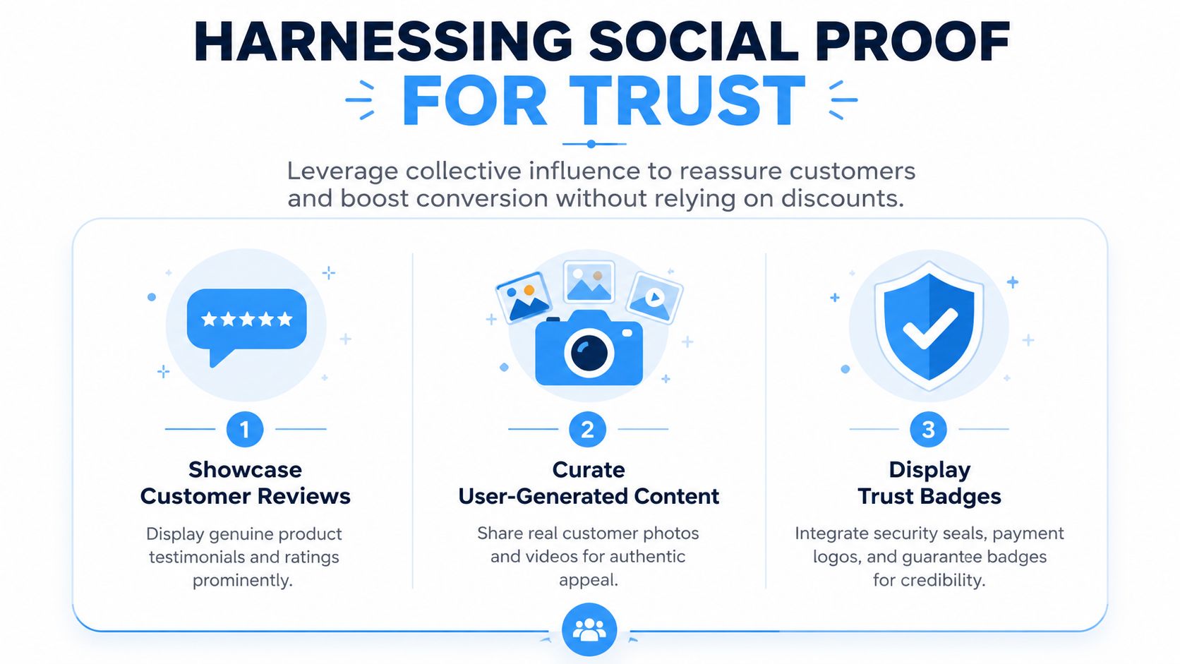
Product-specific proof beats generic praise
Generic store reviews don’t do much for a shopper deciding between one SKU and another. What helps is evidence that this exact product did what it was supposed to do for people with similar needs. Shopify’s enterprise guidance notes that product-relevant reviews about the exact item significantly improve trust and conversion because they show the specific product meets user needs (Shopify Enterprise on increasing conversion rate).
That means your review strategy should prioritize:
- Reviews tied to each SKU
- Customer photos and videos
- Comments that mention use case, fit, quality, or outcome
- Placement near the product title and CTA
If you’re trying to understand why this kind of public validation matters so much online, some of the broader context in SleekPost’s insights on social media creation helps explain how social environments shape credibility and decision-making. Ecommerce doesn’t exist outside that behavior. Buyers are used to checking what other people think before they commit.
Put proof where hesitation happens
Shoppers don’t hunt for reassurance. They either see it when doubt appears, or they leave.
A better setup looks like this:
- Above the fold: Star rating and review count near the product title
- Mid-page: Visual UGC and highlighted review snippets
- Lower on the page: Full review module with filters and keyword search
- Near checkout actions: Payment icons, return reminders, and policy clarity
This structure matters because trust isn’t one thing. Some shoppers want social validation. Others want transactional reassurance.
Live chat works when it reduces real friction
Support isn’t just a service layer. On a product page, it can become a conversion tool. Adding live chat functionality to a Shopify store can increase conversion rates by 40%, especially when it helps shoppers resolve pre-purchase hesitation in real time, and that effect gets stronger when reviews are displayed prominently above the fold (Toptal’s Shopify CRO tactics).
The key is using chat well. Don’t greet every visitor with an aggressive interruption. Use it to answer things like:
- Sizing and compatibility questions
- Delivery timing
- Bundle or variant selection
- Policy clarification
A shopper asking a question is often closer to buying than a shopper silently browsing.
For more ideas on making trust visible across the journey, Quikly’s article on social proof marketing is a solid reference.
What doesn’t build trust
Some tactics create the appearance of trust while undermining it.
Avoid these:
- Generic testimonials with no product context
- Overdesigned trust badges that look pasted on
- Review tabs hidden below long blocks of brand copy
- Chat widgets that trigger before the user has even read the page
Trust has to feel earned. The best social proof doesn’t scream. It reassures.
Create Real Urgency with Behavioral Promotions
Urgency isn’t the problem. Fake urgency is.
A lot of CRO advice still defaults to the same tired move. Add a countdown timer, throw in a low-stock message, hope people panic, then wonder why repeat purchase quality slips. Shoppers have seen that pattern too many times. If the urgency looks staged, it doesn’t motivate. It cheapens the store.
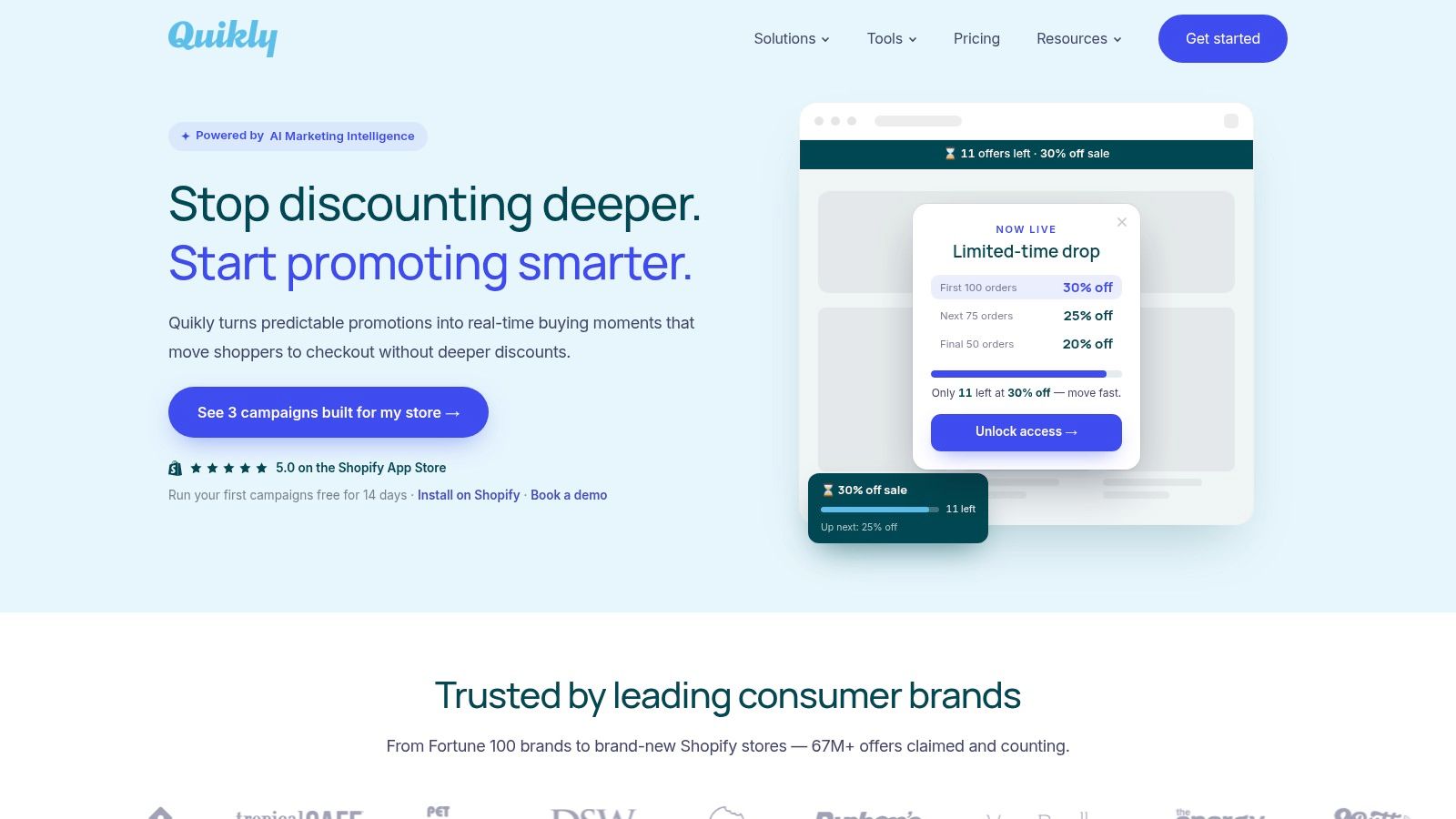
Scarcity works when the limit is real
Behavioral psychology gives you the useful framework here. Loss aversion and scarcity bias matter because buyers value opportunities differently when access is limited and credible. The word that matters is credible.
Authentic, time-and-quantity-bound scarcity mechanisms increase conversion rates by 15–22% when anchored to real inventory data. But 68% of implementations fail because merchants fabricate stock limits or use perpetual timers, which erodes trust and reduces conversion by 9–12% within 30 days (Shopify Community discussion on improving conversion without more ad spend).
That trade-off is where most brands get this wrong. They treat urgency like design garnish instead of an operational promise.
What real urgency looks like
The strongest non-discount promotions don’t rely on sitewide markdowns. They create a reason to act now that feels earned.
Examples include:
- Quantity-capped rewards tied to actual inventory or actual campaign limits
- Short claim windows that don’t drag on until shoppers stop believing them
- Tiered offers where the best reward goes first and later shoppers still get something, just not as much
- Non-discount rewards such as early access, bundled extras, or VIP status
These structures work because they align with how people decide. They reward action without telling everyone to wait for the next broad sale.
The difference between pressure and participation
Basic countdowns create passive waiting. Behavioral promotions create active participation. That’s a meaningful difference.
A shopper seeing “sale ends tonight” may still delay. A shopper seeing a capped reward with visible progress understands that acting earlier changes the outcome. That taps into commitment and consistency. Once the buyer enters the experience, the decision feels more immediate and more concrete.
Field note: If your urgency tactic would still show the same message next week to the same shopper, it probably isn’t urgency. It’s decoration.
This is also where brand equity enters the picture. Real urgency doesn’t have to feel pushy if the logic is transparent. If inventory is limited, say so. If only a fixed number of shoppers can claim a reward, make that clear. If the campaign ends at a real time, end it.
A better promotion design for Shopify brands
If you’re trying to increase conversion without damaging full-price integrity, build promotions around these rules:
| Approach | What it signals |
|---|---|
| Blanket sitewide discount | Price is negotiable, waiting pays |
| Perpetual countdown timer | The brand is forcing urgency |
| Quantity-capped reward | Early action has a real advantage |
| Time-bound non-discount perk | The brand values decisiveness, not bargain hunting |
One of the more overlooked ideas in this area is the use of capped claim counts rather than generic open-ended timers. In the Shopify community, merchants have pointed out that capped offers can convert 2–3× higher than open timers because they create an “act early beats wait” mechanic without immediately collapsing margin (Shopify Community discussion on effective conversion tactics).
That doesn’t mean every store should run scarcity all the time. Constant pressure creates fatigue. The better move is selective use around launches, seasonal moments, high-intent retention flows, or inventory-sensitive campaigns.
The brands that preserve value don’t avoid urgency. They stop faking it.
Secure the Sale in Checkout and Beyond
A shopper who adds to cart has already done a lot of mental work. They’ve accepted the price, chosen the product, and moved toward purchase. Losing that buyer because checkout feels annoying is one of the most preventable conversion failures in ecommerce.
At this point, clarity matters more than persuasion.
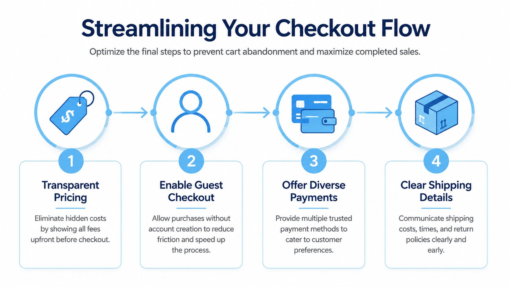
Remove friction from the final steps
On Shopify, a cleaner checkout usually comes down to discipline. Show total costs early. Make payment options obvious. Don’t force work that isn’t necessary.
Focus on these checkout basics:
- Surface pricing transparently. Hidden fees are where trust disappears.
- Offer familiar payment methods. Shop Pay and other trusted options reduce hesitation.
- Allow guest checkout where possible. Account creation can wait.
- Keep form fields tight. Every extra field gives the buyer another chance to reconsider.
A visible progress cue also helps. The Yotpo guidance cited earlier notes that pairing mobile CTA improvements with checkout progress bars can reduce abandonment by 22% (Yotpo on Shopify conversion tactics). At this stage, reassurance is mechanical. The buyer wants to know how close they are to done.
Don’t waste abandonment recovery with another coupon
Most brands treat cart recovery like a discount delivery system. That’s lazy and expensive. If every abandoned cart gets the same markdown, customers learn to abandon on purpose.
A better strategy is to recover intent without resetting price expectations. Merchants lose 40–60% of high-intent buyers by defaulting to flat discounts in abandonment recovery. Replacing those discounts with time-bound, quantity-capped rewards in post-purchase flows lifts repeat purchase conversion by 18% and average order value by 12% (Shopify Community discussion on post-purchase conversion gaps).
That idea matters beyond cart recovery. The thank you page, follow-up email, and SMS sequence shouldn’t rush back to “here’s 15% off your next order.” They should reinforce the choice the customer just made and give the next action a reason to feel timely.
Use the post-purchase window well
The post-purchase experience is where brands either deepen value or undercut it.
Good post-purchase moves include:
- Care instructions or usage tips that help the customer succeed with the product
- Cross-sell recommendations that make contextual sense
- Early-access or capped reward invitations for a second purchase
- Review requests tied to the exact product purchased
What works here is relevance and timing, not blanket incentives. A customer who just bought doesn’t need another generic sale. They need a reason to stay engaged with the brand on better terms.
The sale isn’t fully secured when payment clears. It’s secured when the customer feels good about buying at your price.
If your team wants a better way to drive action without training customers to wait for markdowns, Quikly is built for that job. It helps Shopify brands run time and quantity-bound promotional experiences that reward shoppers who act now, not the ones who hold out for the next blanket discount. The approach has been refined across more than 60 million consumer interactions, stays fully on-brand, and gives merchants a practical way to improve conversion while protecting margin and brand value.
Topics: shopify conversion rate, ecommerce conversion, increase conversions, no discount strategy, behavioral marketing